Team Account & Admin Portal
Role
Timline
Sep – Nov 2025
Scope
UX flows, UI design
Work with
PM, Eng Team
Designed a new team account & admin portal so enterprise customers can share one Validation Cloud account, manage roles, and centralize billing.
About Validation Cloud
Validation Cloud is a Web3 infrastructure company.
We provide node, data, and staking services for enterprise clients in Web3.

Context
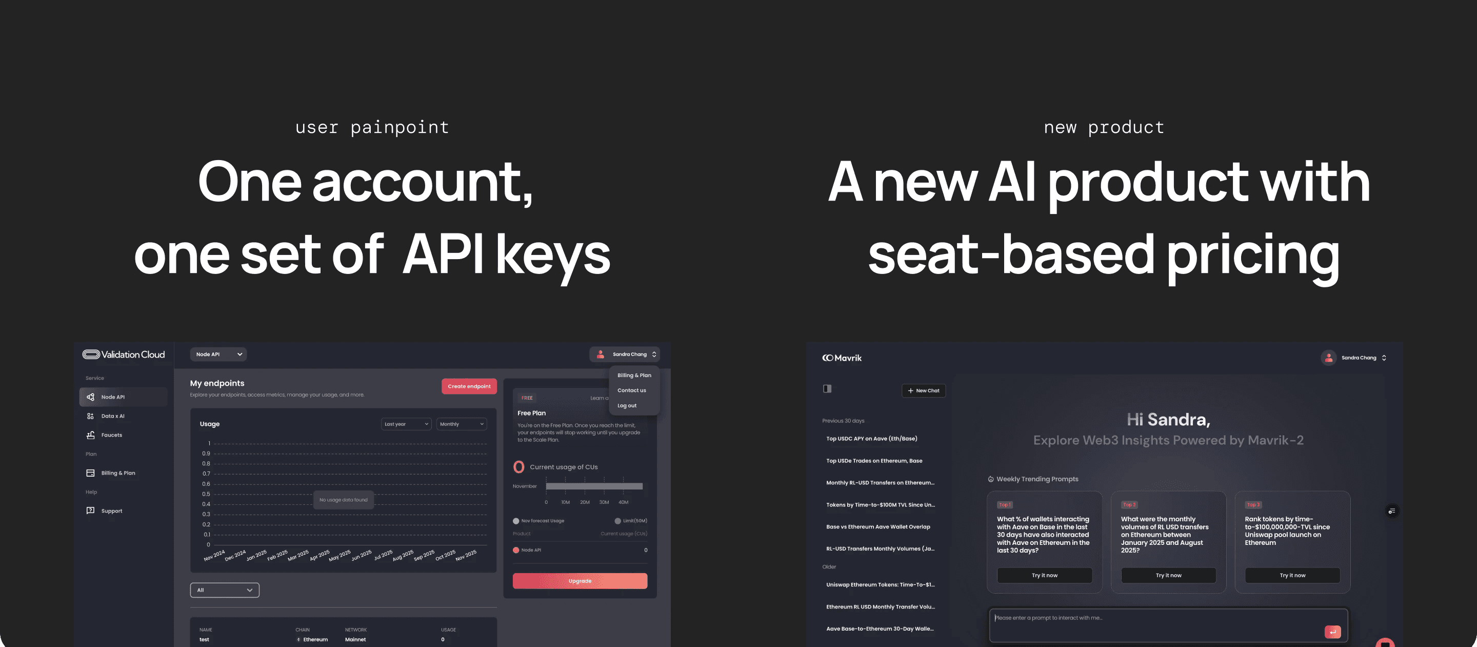
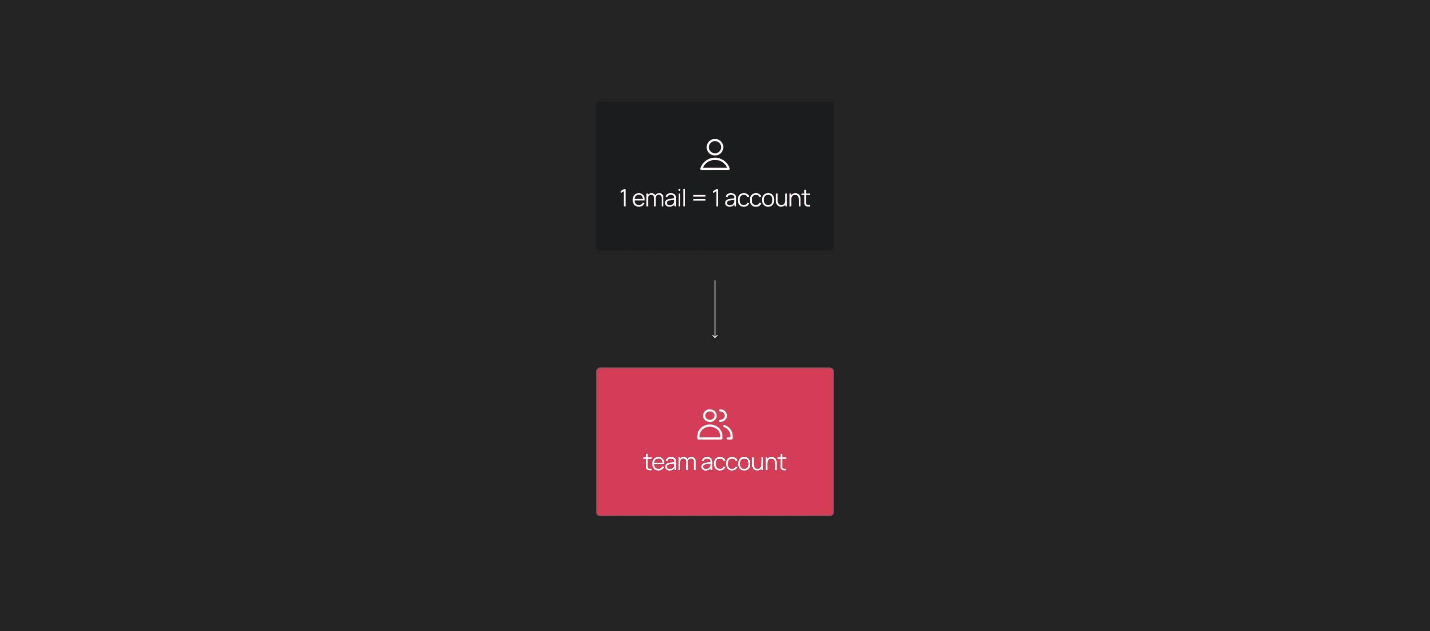
Up until now, our platform only supported individual accounts, which created a lot of friction for our larger enterprise customers — they had to share a single email and password internally just to share keys — which is insecure, hard to manage, and impossible to scale.
At the same time, we recently launched a new AI product with seat-based pricing, so we needed team accounts and billing at the organization level. So that’s why we started designing a team account model where multiple people could access one account.
Goal
The goal was simple: Let multiple people from the same org share one Validation Cloud account, have the right level of access, and manage billing centrally. We also aimed to keep the mental model simple for Phase 1, so it wouldn’t break existing customers or complicate onboarding.
Let multiple people from the same org:
Share one account
Have different permissions
See and manage billing in one place
Research
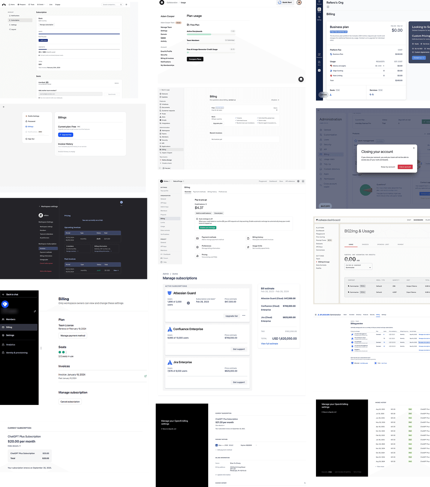
I started by studying how collaboration tools handle roles, permissions, and team structures — things like ChatGPT, Figma, Slack etc — and also looked at competitors like QuickNode and Helius.
The biggest takeaway was to keep the model extremely teachable: clear roles, clear scopes, and permission tables that users can understand immediately. This really help shape how we defined our Phase 1 roles.
Define Roles & Flows
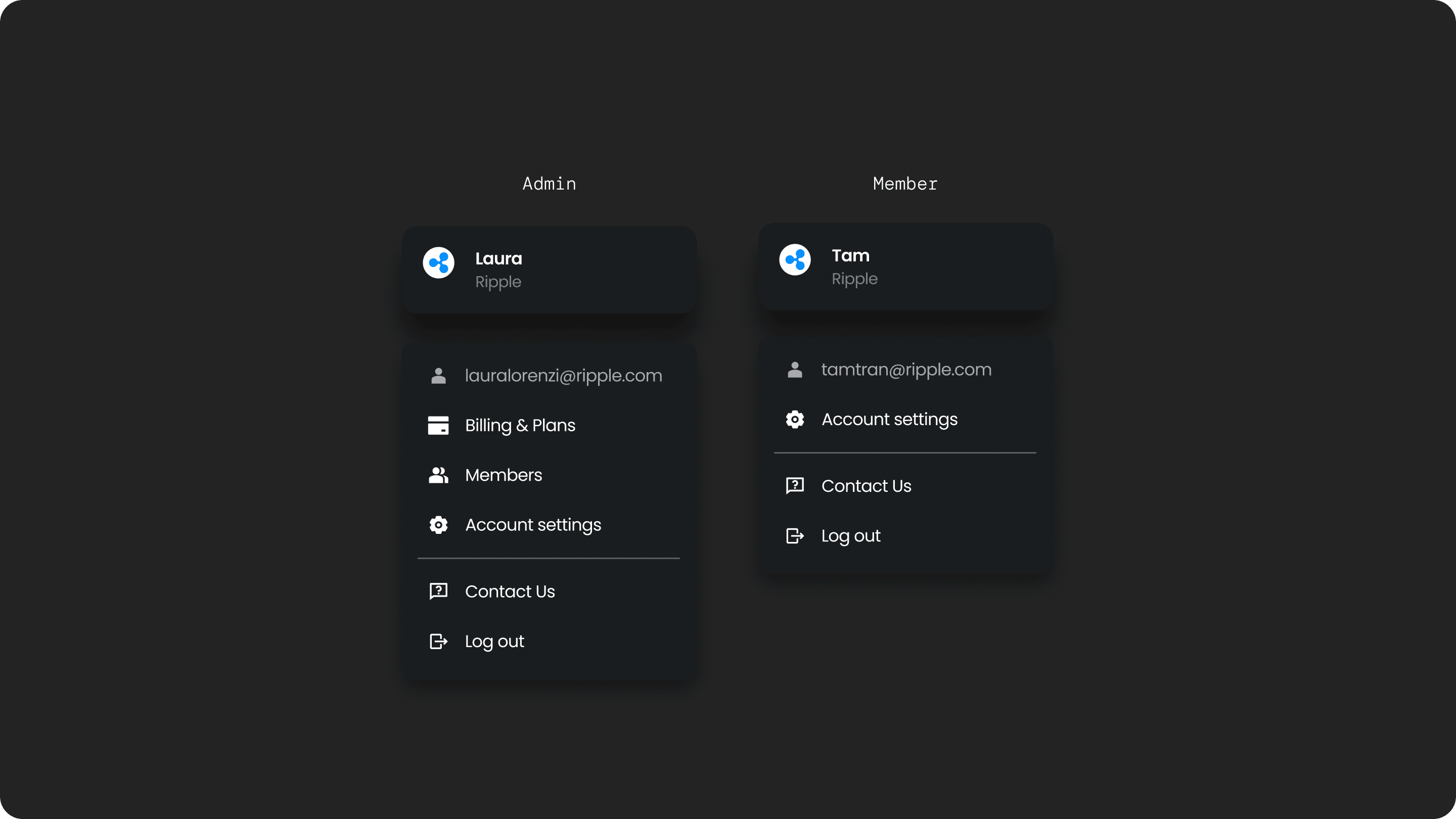
So for P1, we kept roles very simple: Admins can manage billing, invite teammates, and manage roles. Members can just use the products. This already unlocks 90% of enterprise use cases without overwhelming people with complexity.
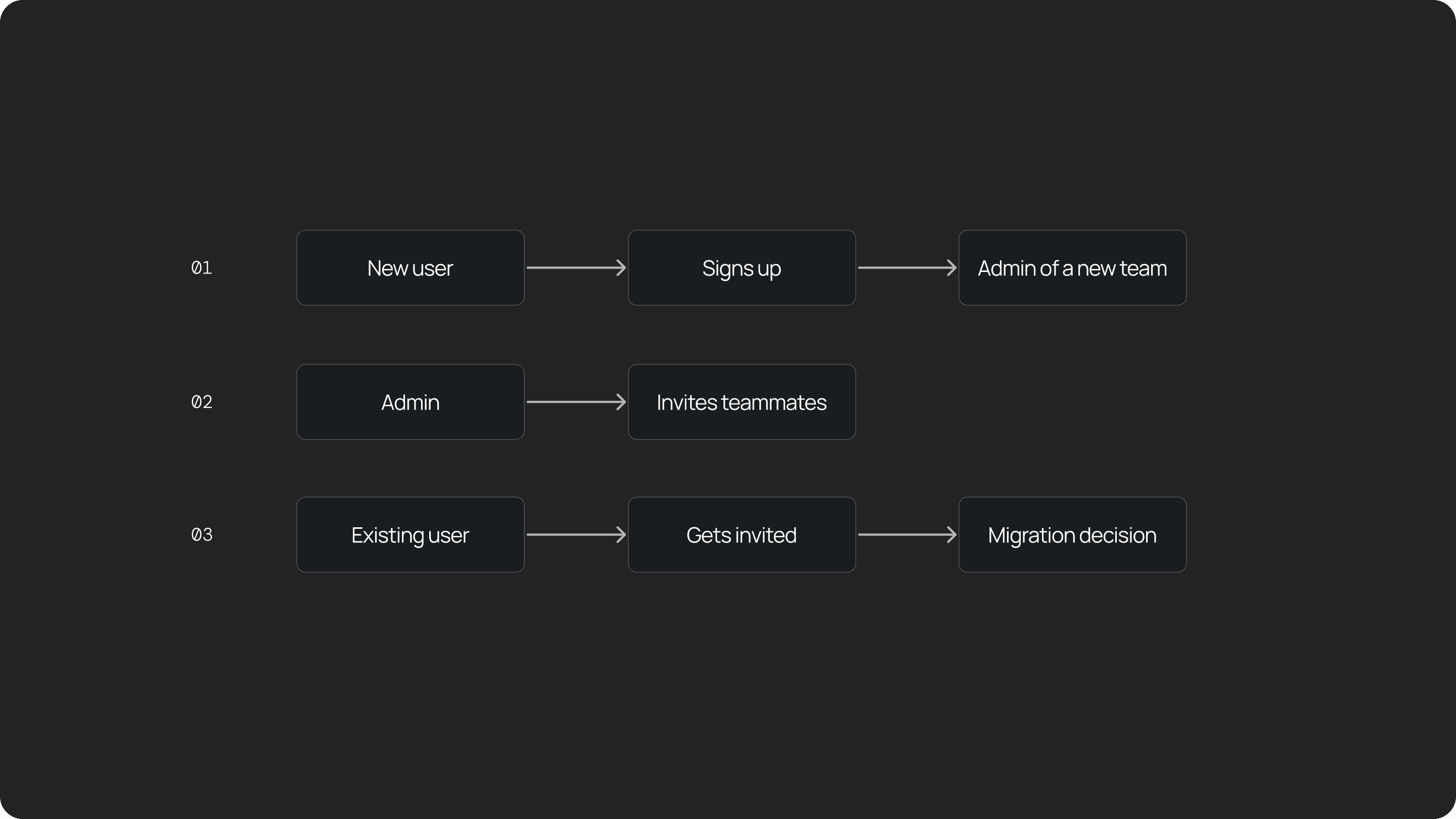
From there, I designed three key flows:
New users: When someone signs up, we quietly create a team for them and make them the admin.
Admin inviting teammates: Admins can invite colleagues and assign roles.
Migration for existing users: If someone already has an individual account and gets invited to a team, we guide them through a migration flow and help them migrate safely.
UX Challenge 01
How do we design the Admin portal UX?
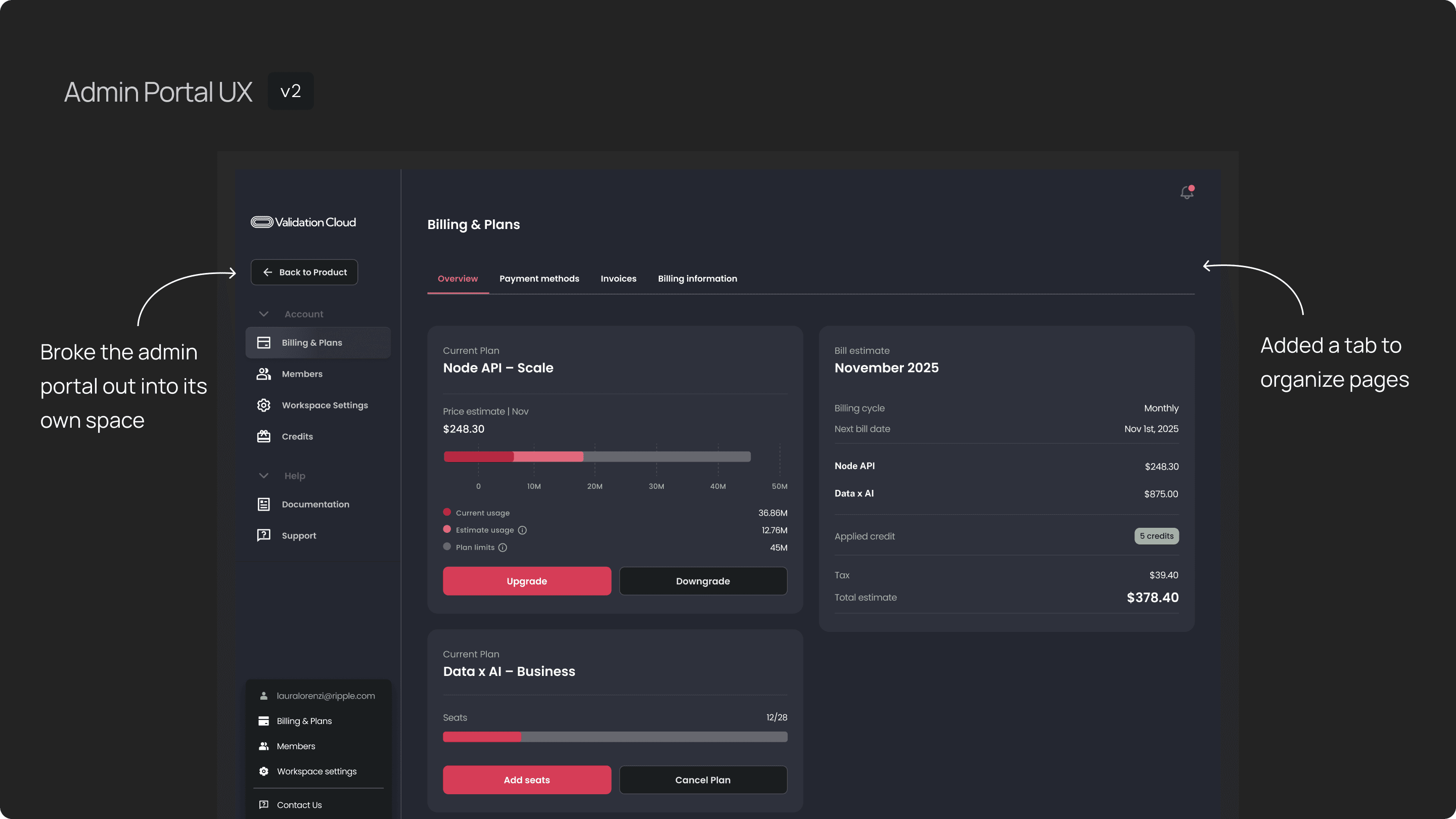
My first approach tucked the admin portal into our existing sidebar. you can find the entrance to billing, plans and team management. On the right side is the billing and plan, you can see current subscription, billing information, payment etc. I used the bento style cards to group different information.
This reused our current UI pattern, we switched to different pages through sidebar, and group the information in cards. I kept development light, and aligned with most of our UI components.
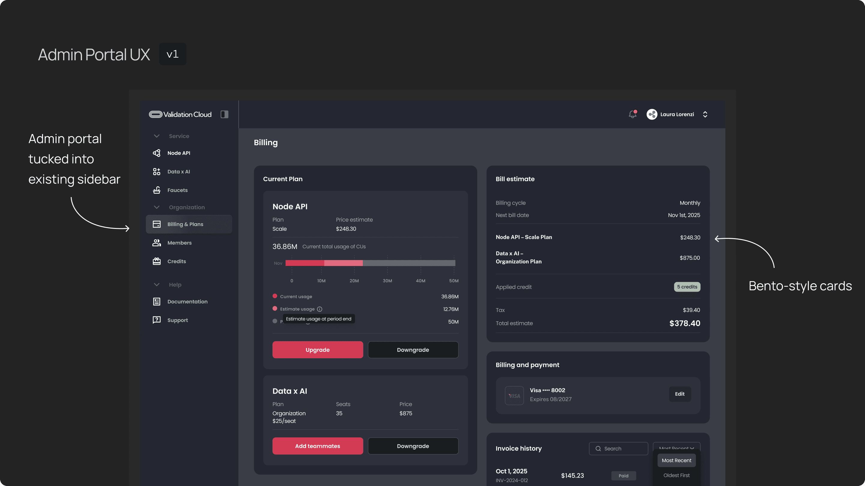
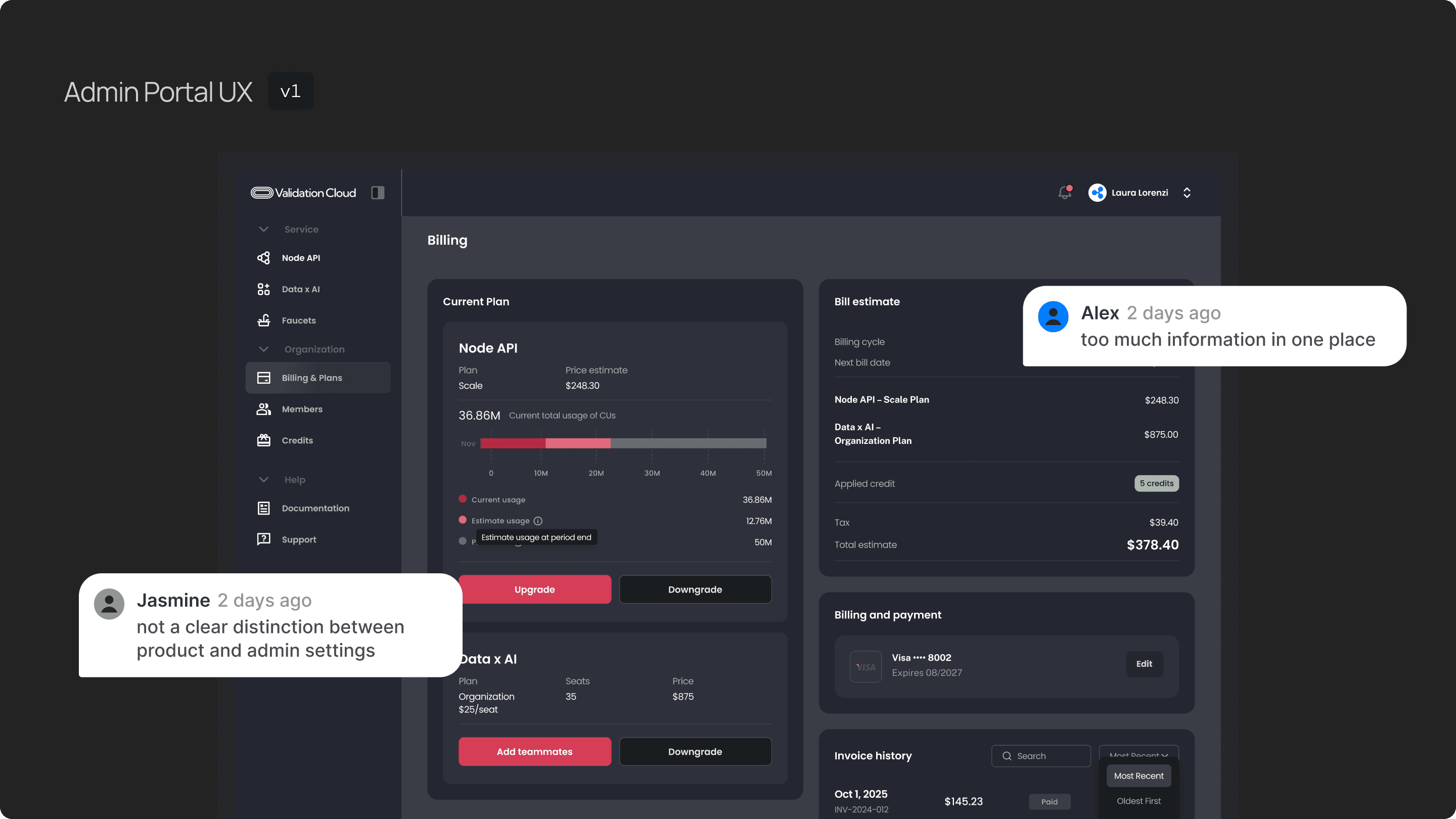
But it overloaded the page — too much information in one place, and not a clear distinction between “product” and “admin settings.”
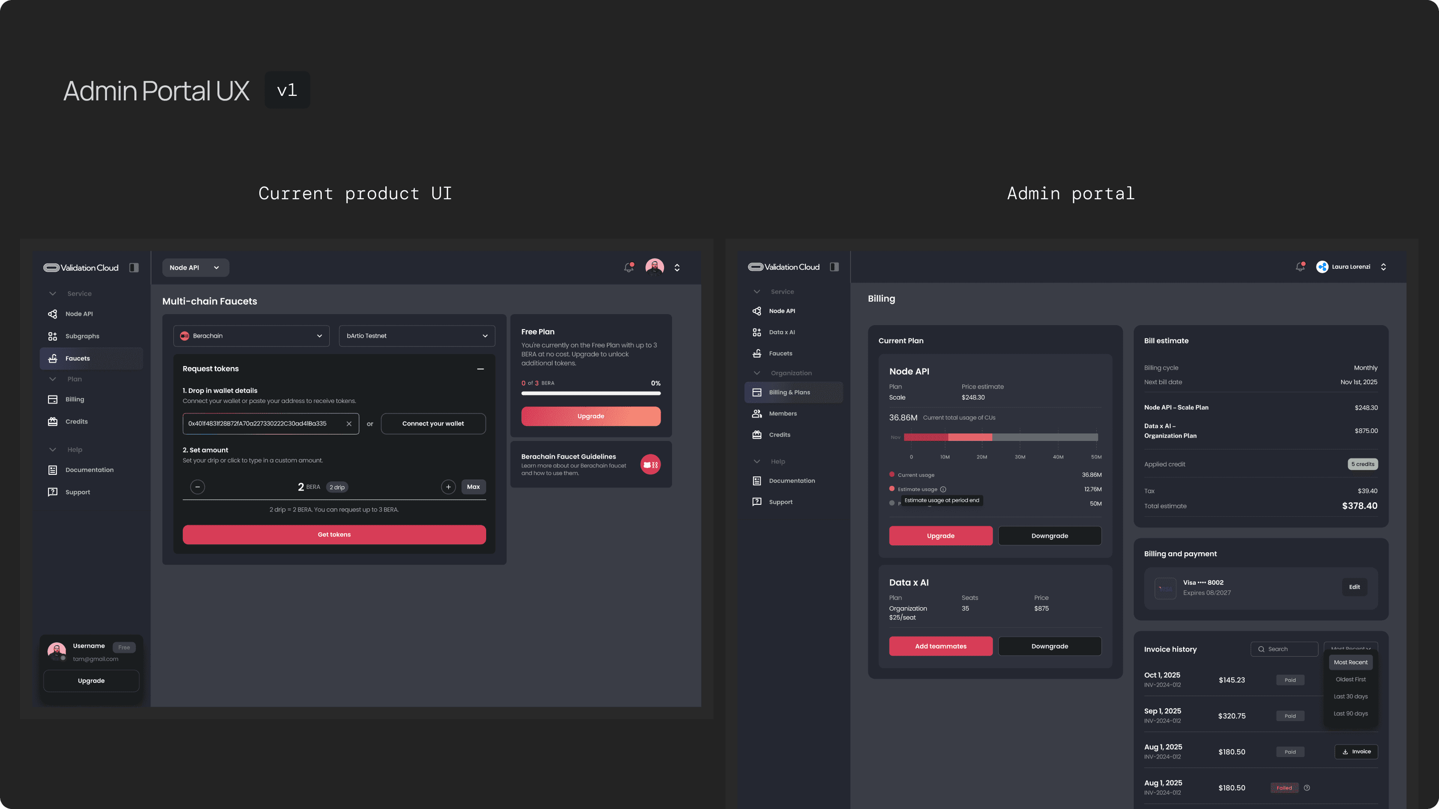
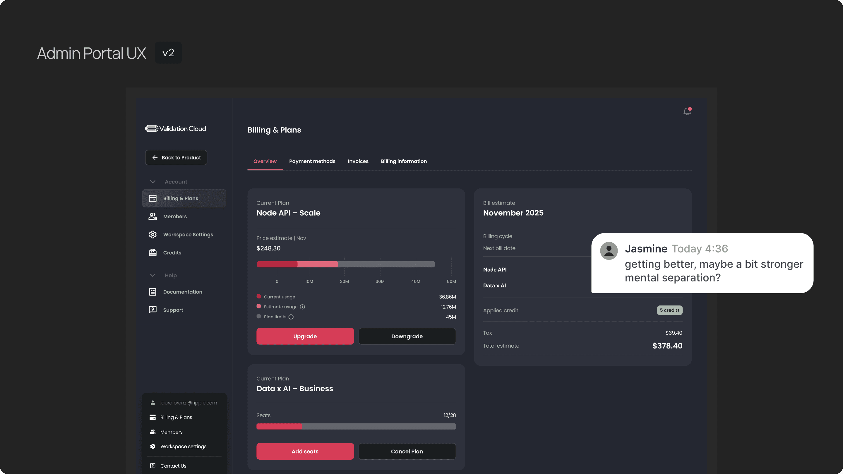
The second iteration broke the admin portal out into its own space.
This solved clarity issues but still felt visually anchored to the product UI despite i’ve changed the background color, so admins didn’t get a strong mental separation between managing infrastructure vs managing the team.
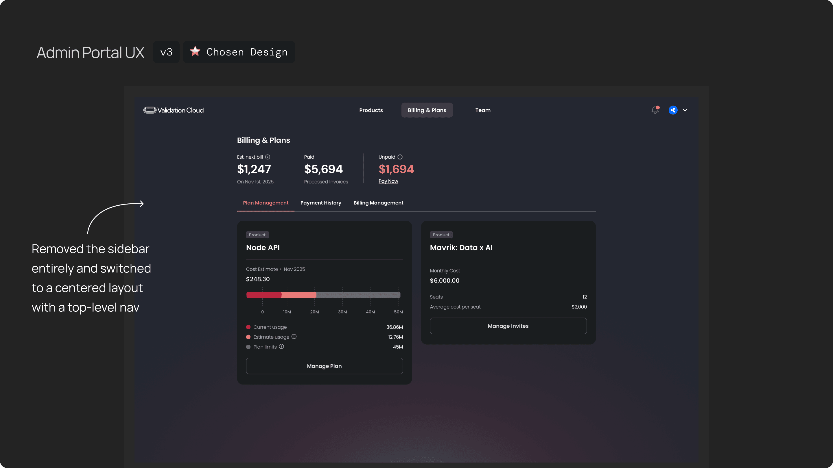
In the final direction, I removed the sidebar entirely and switched to a centered layout with a top-level nav. This made the admin portal feel like a clean entry point, and users could easily switch between Billing & Plans, Team, and Products. This version resolved the complexity issues and was the one we moved forward with.
UX Challenge 02
How do we design the invite flow
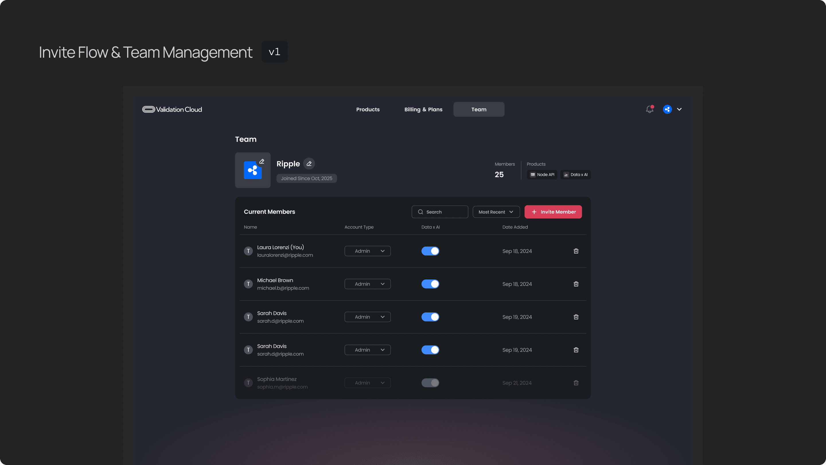
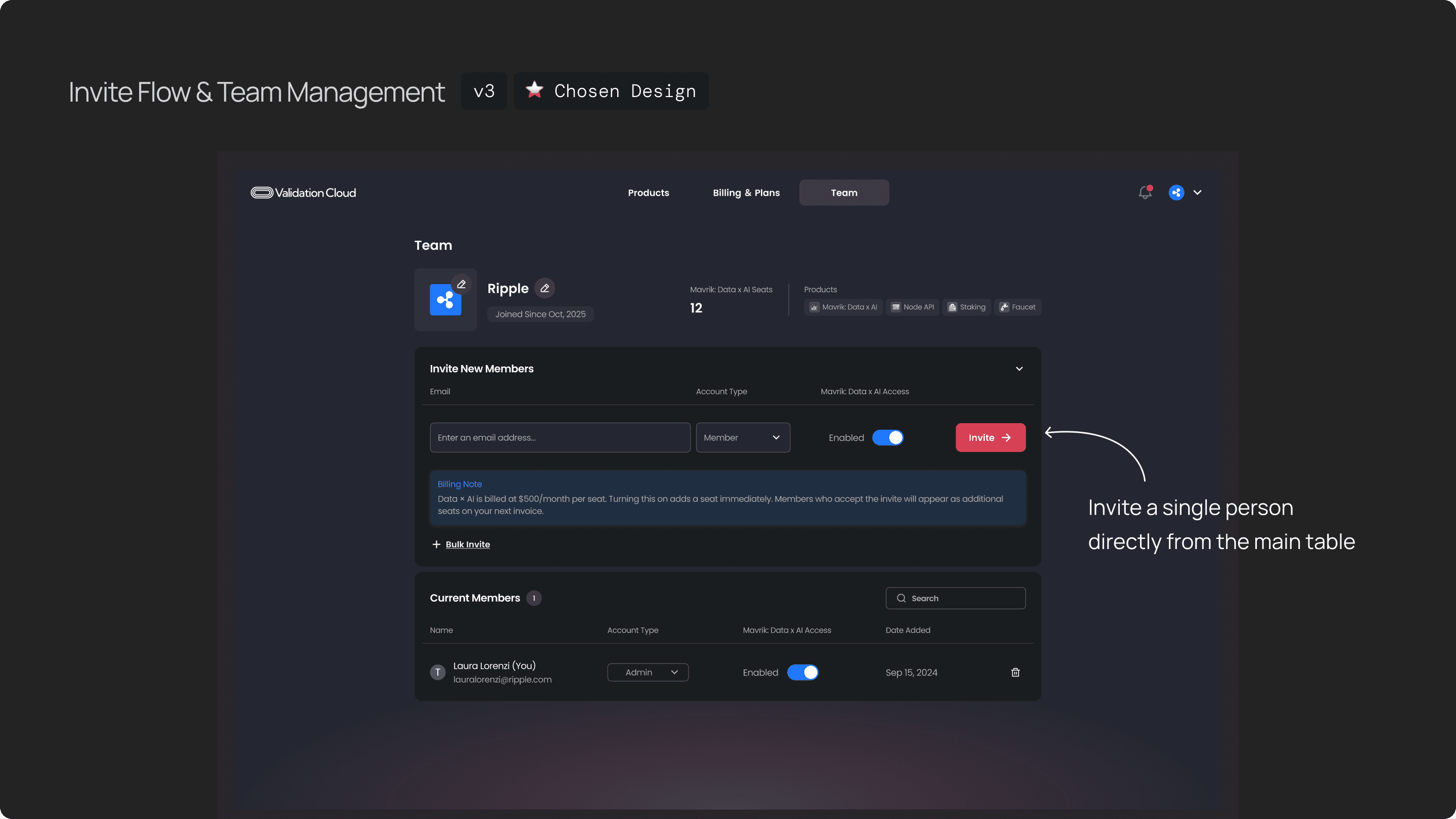
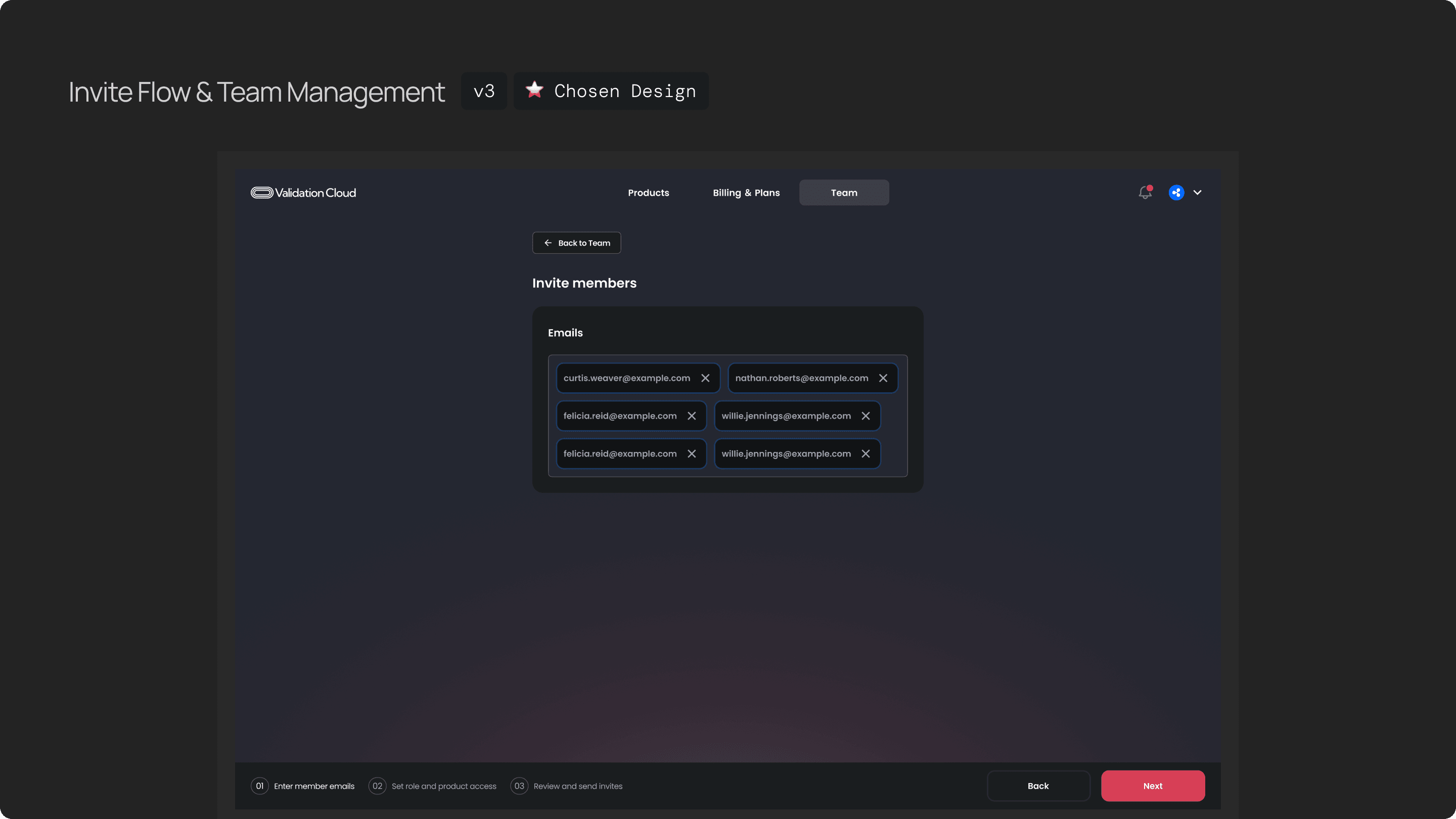
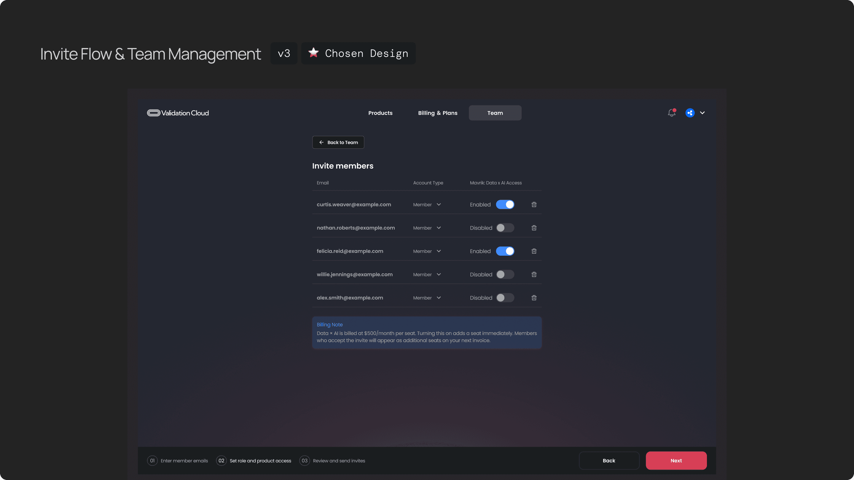
This is the team management page, there are team profile, how many members on the team, and the full list of members.
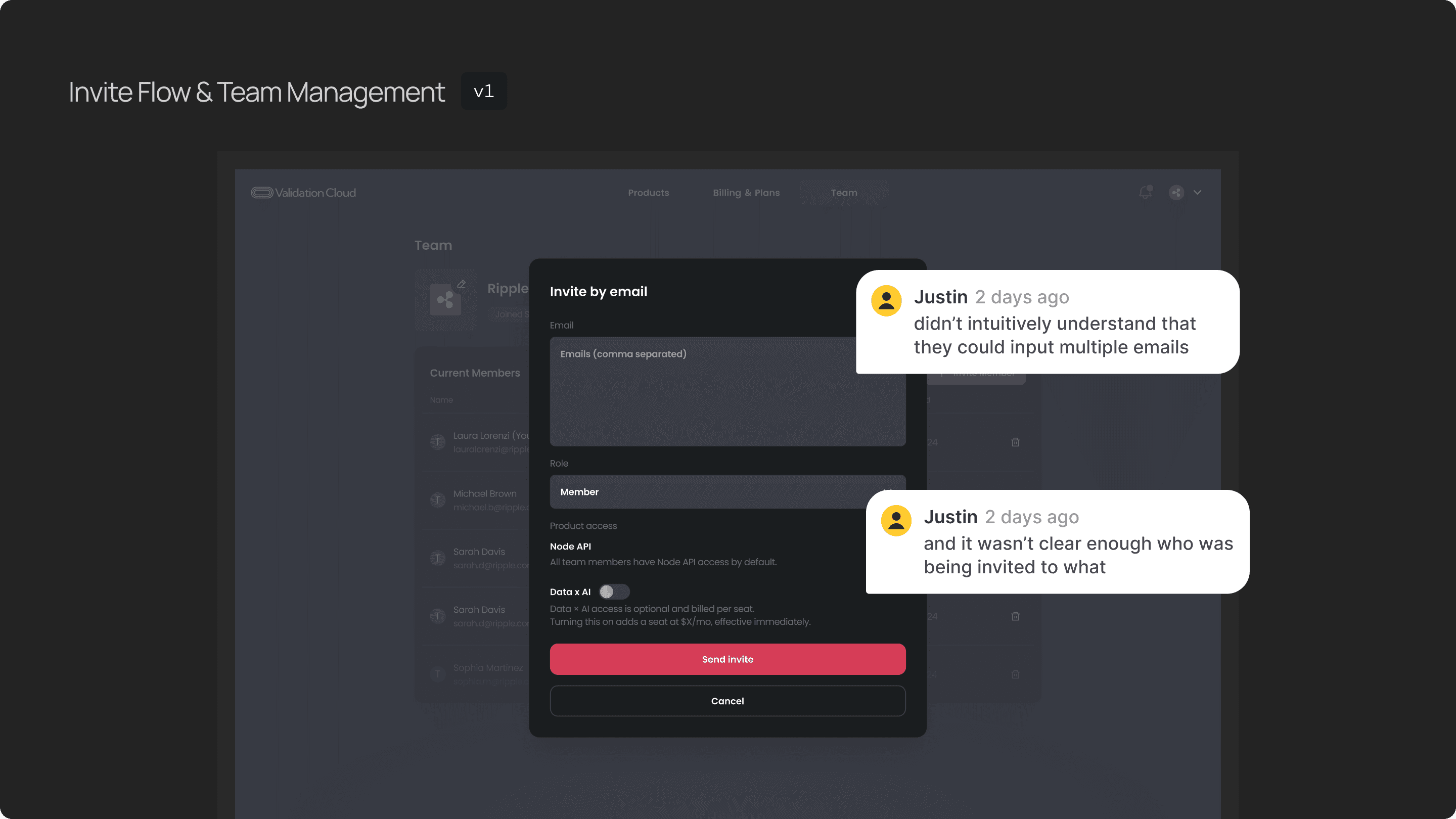
The first version allowed admins to paste multiple emails at once, assign the role and product access and send invites. But users didn’t intuitively understand that they could input multiple emails, and it wasn’t clear enough who was being invited to what.
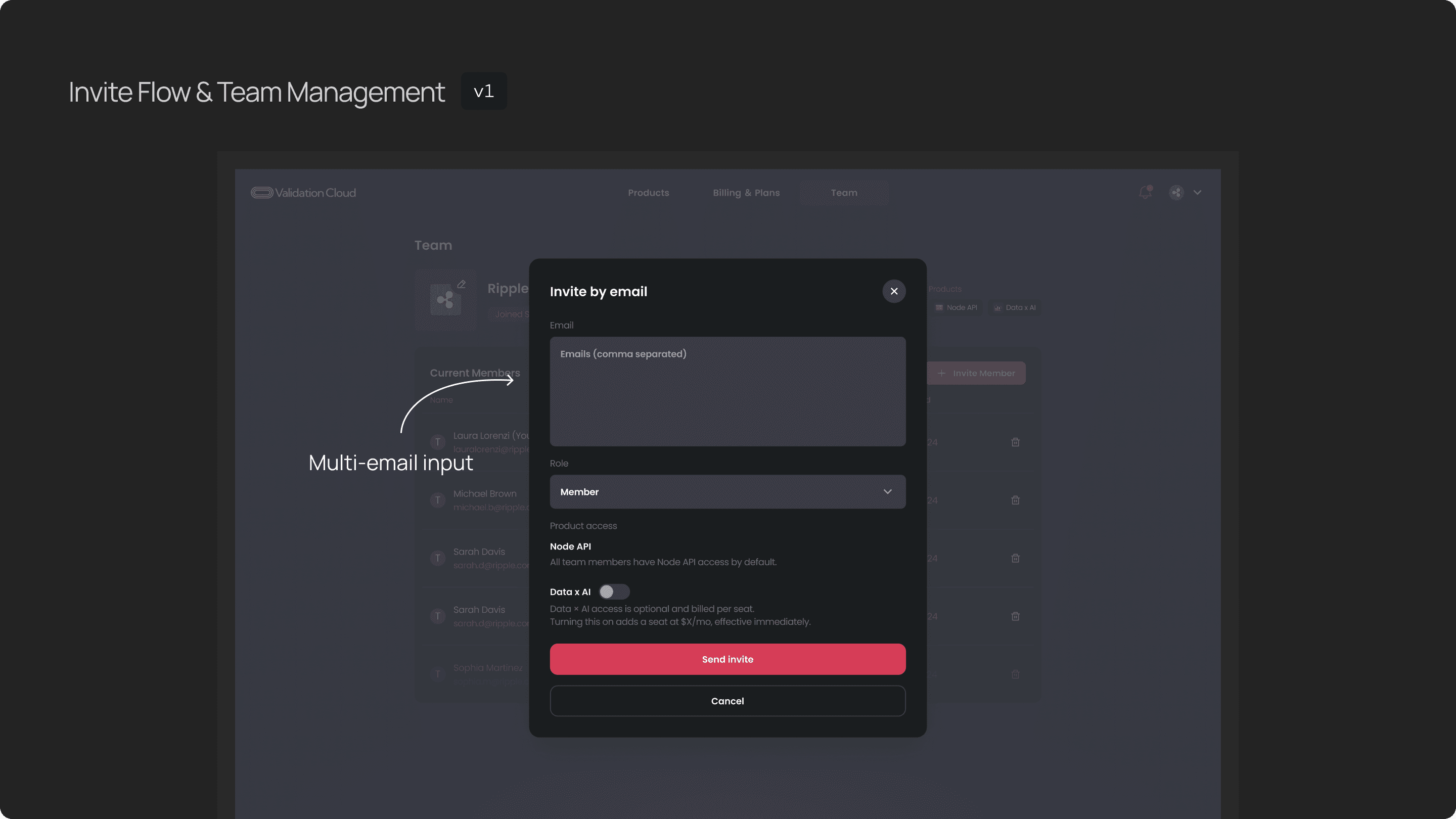
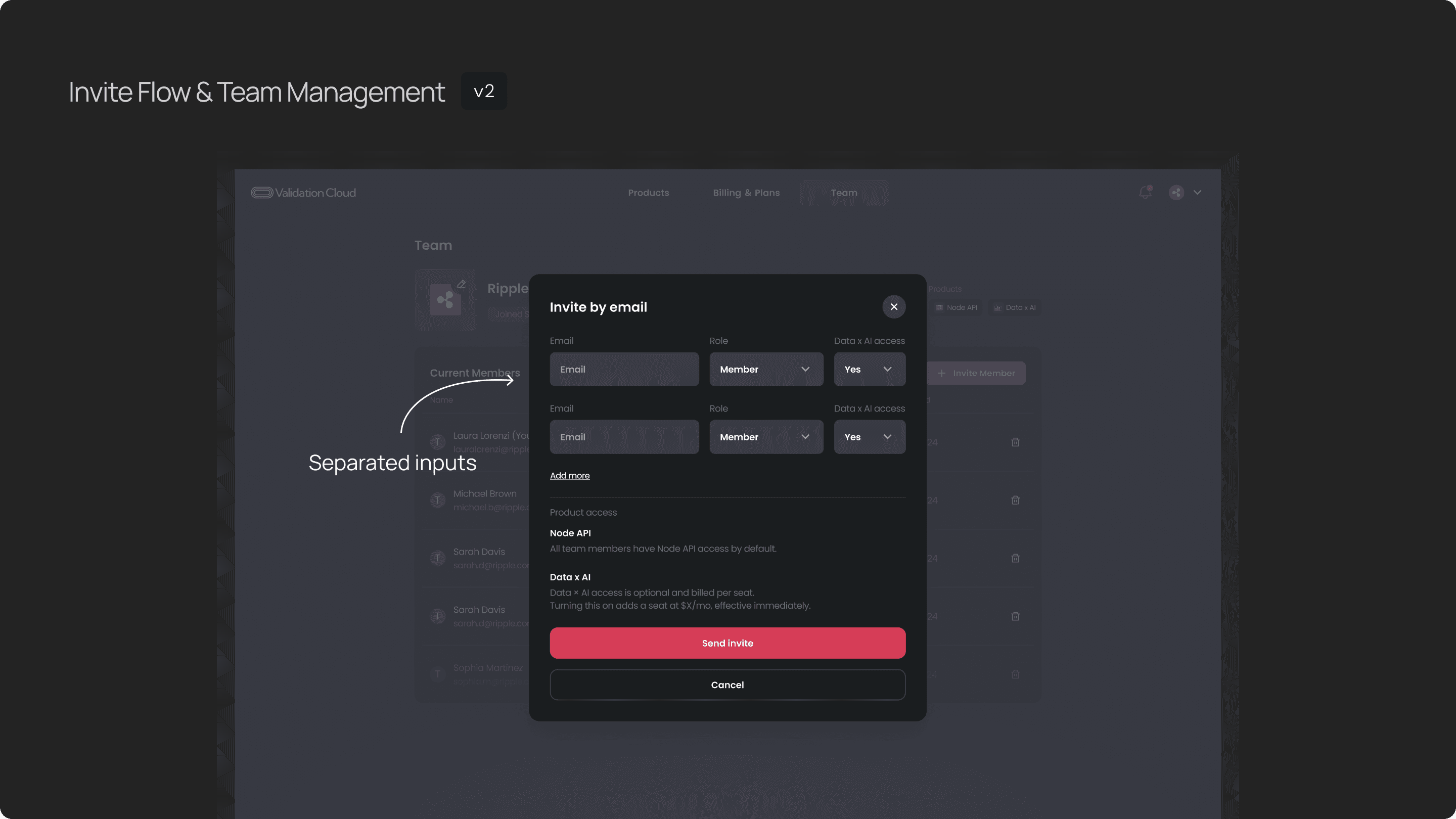
So I separated each email, role, and product access into its own row. We can see clearly each email and its role and product access.
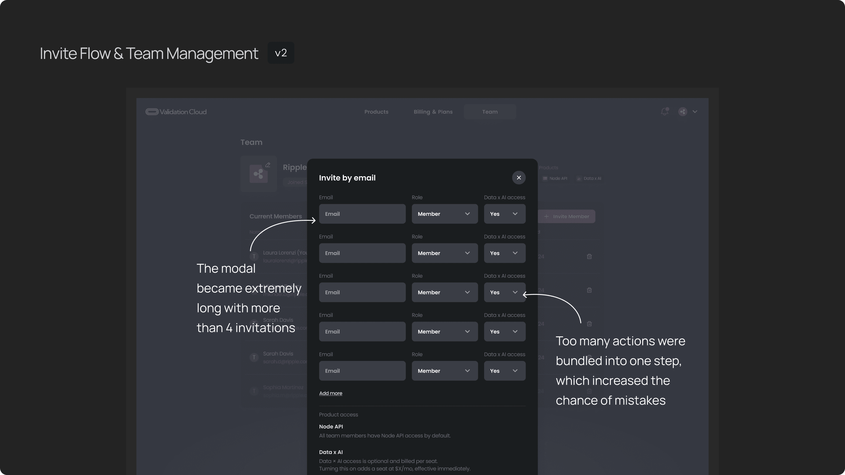
This was much clearer, but we found another UX issue, the modal became extremely long with more than 4 invitations — users had to scroll, and too many actions were bundled into one step, which might increase the chance of mistakes when users input the information.
In the final flow, I combined the strengths of both versions. You can invite a single person directly from the main table, which is the most common action. You can enter the email, assign the role and toggle the product access.
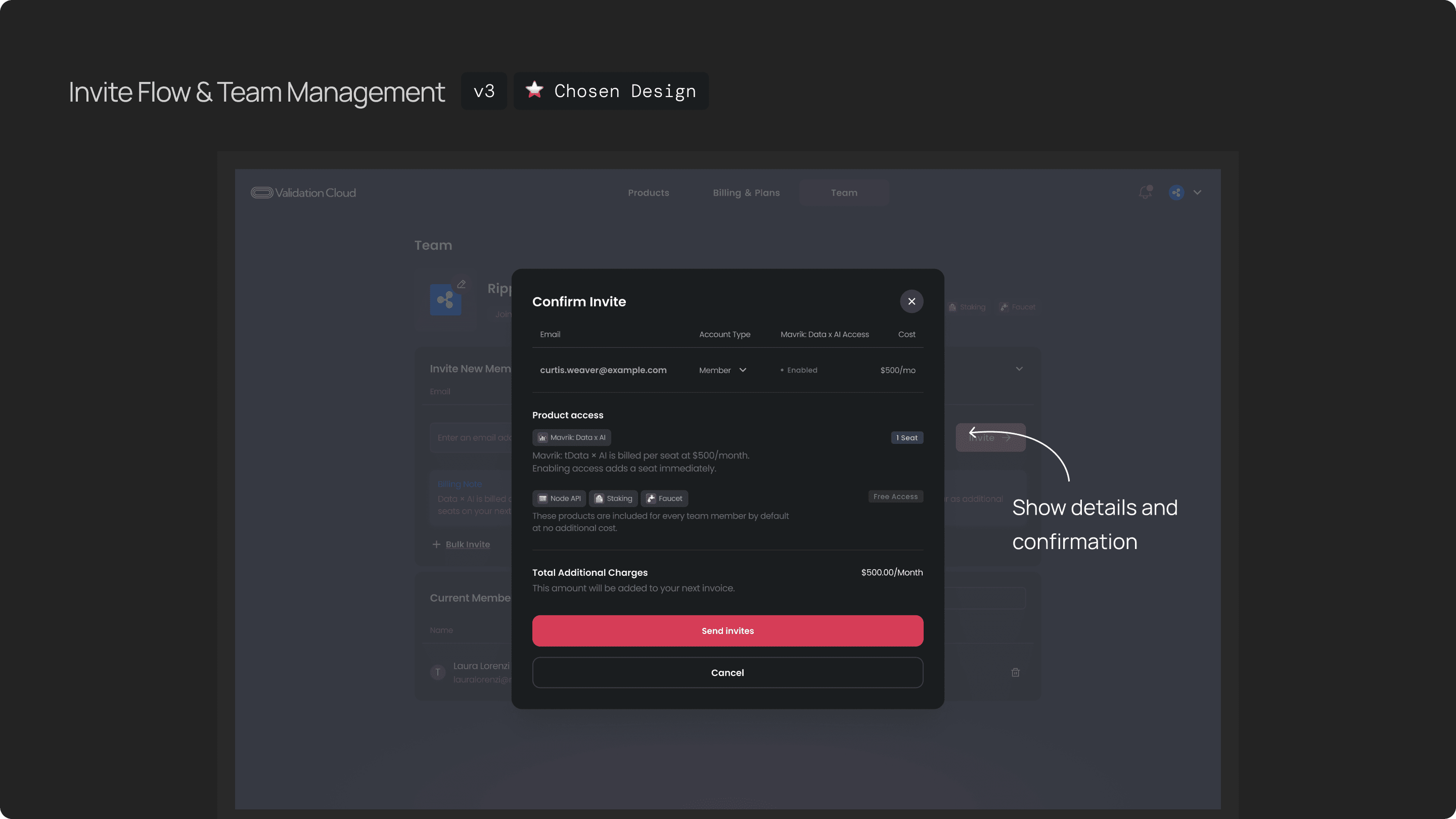
After you click on invite button, the confirmation modal shows up, you can double check the details and the further charging info before you actually send invite.
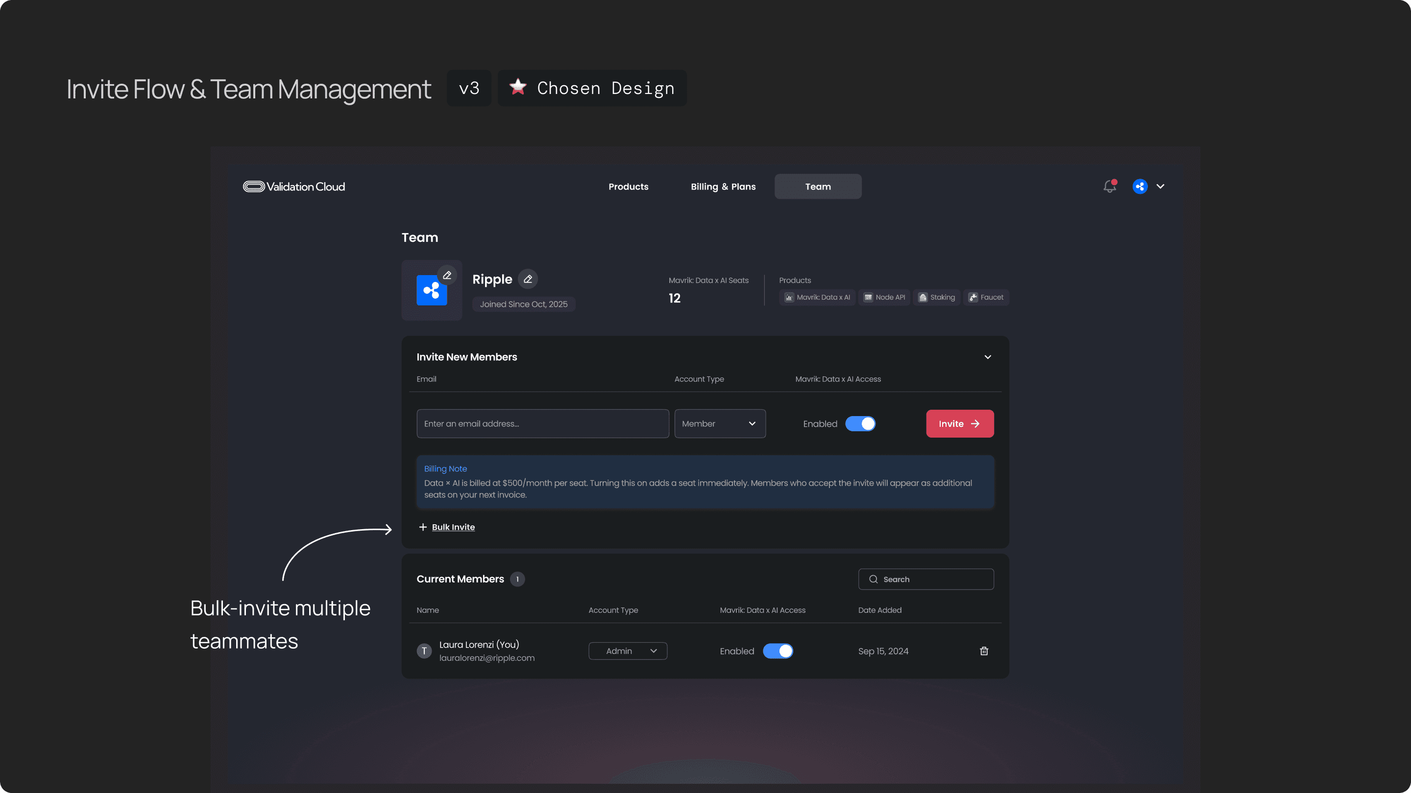
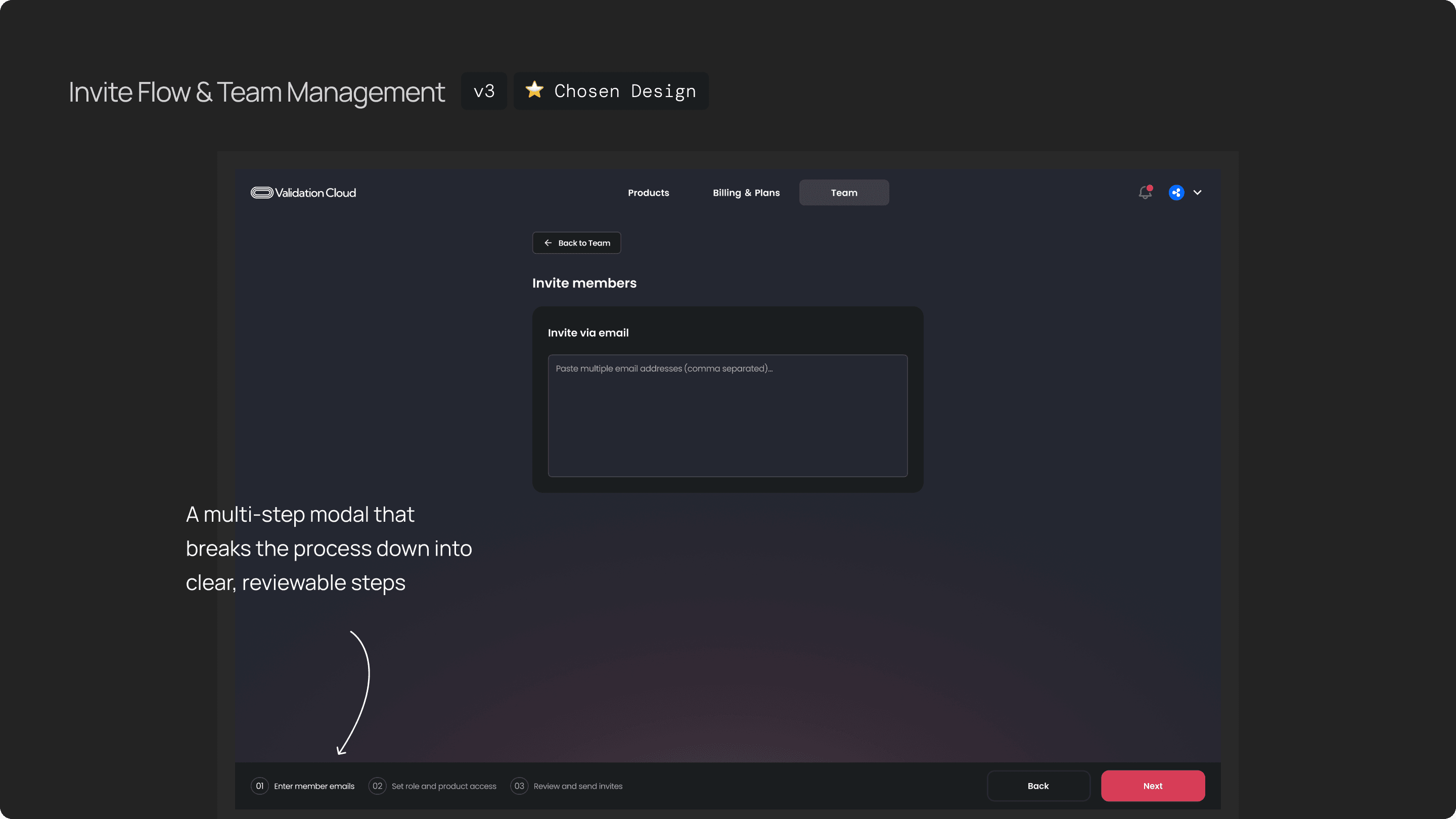
We also provide a way if you want to invite multiple members, if click bulk-invite, it will tak you to a a multi-step that breaks the process down into clear, reviewable steps. This improved clarity, reduced errors and make the flow smoother and flexible.
Research
The first big takeaway for me was that a simple Version 1 is almost always better than a perfect Version 1. In the beginning, we spent a lot of time debating things like:
how many roles we should support?
whether one email can belong to multiple teams?
and what the long-term model should look like?
Those conversations were important, but for Phase 1, we realized that intentionally keeping the model simple — one team per user and just two roles — already solved most of the enterprise pain points without introducing unnecessary complexity. And because we kept the structure clean, it still leaves room to scale into more advanced scenarios later.
The second takeaway was around balancing UX with technical and billing constraints. When you deal with things like data migration, orphaned keys, and seat-based billing, the backend gets complicated very quickly. So involving engineers early and having frequent check-ins was critical. It helped ensure that even though the underlying system is complex, the UI still feels calm, predictable, and safe for users.
