
Role
Timline
Dec 2025 – Mar 2026
Scope
Brand · Website · System · Tooling
Work with
PM, Engineers, BD, C-level
Designed and implemented a unified brand and design system across product and marketing for a Web3 AI platform — including a full site rebuild and an AI-powered internal Brand Hub that enables the whole team to execute consistently, without depending on a designer.
View it Live
+25%
Increase in lead form submissions after navigation restructure
1
Unified design language across all product and marketing surfaces
0
Designer dependency for routine asset requests — teams self-serve via Brand Hub


Keep reading the full case study
About Validation Cloud
Validation Cloud is a Web3 infrastructure company.
We provide node, data, and staking services for enterprise clients in Web3.

Context
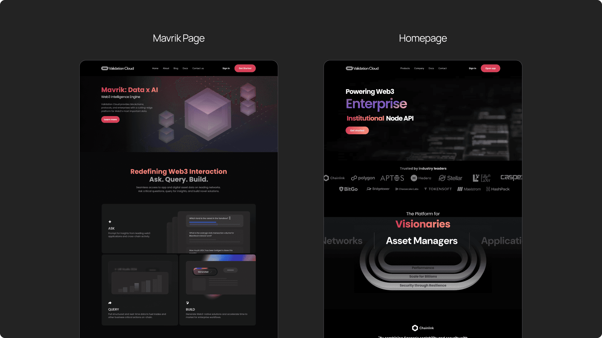
Validation Cloud is a Web3 B2B SaaS platform providing node API, staking, and AI data services to enterprise clients. As the product suite grew, so did the fragmentation: the website, product surfaces, and marketing assets all looked like they came from different companies.
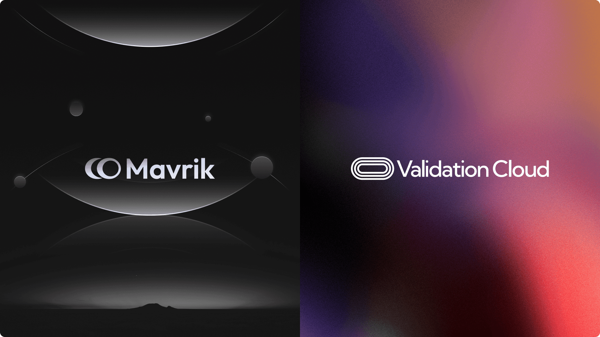
When Mavrik, the new AI data product, launched with its own marketing page, the disconnect became undeniable. It used too many colors, failed to explain what it did, lacked credibility signals, and had no clear conversion path. The bounce rate at the hero was high.
The real problem wasn't one bad page. It was that there was no shared design system — no source of truth to keep every touchpoint coherent as the team and product grew. Design execution depended entirely on manual work, and tribal knowledge.
The goal was to fix this at the root: build a scalable, unified system that aligns the brand across all surfaces, enables faster execution for both design and non-design teams, and supports the AI-driven future the company is building toward.
Process
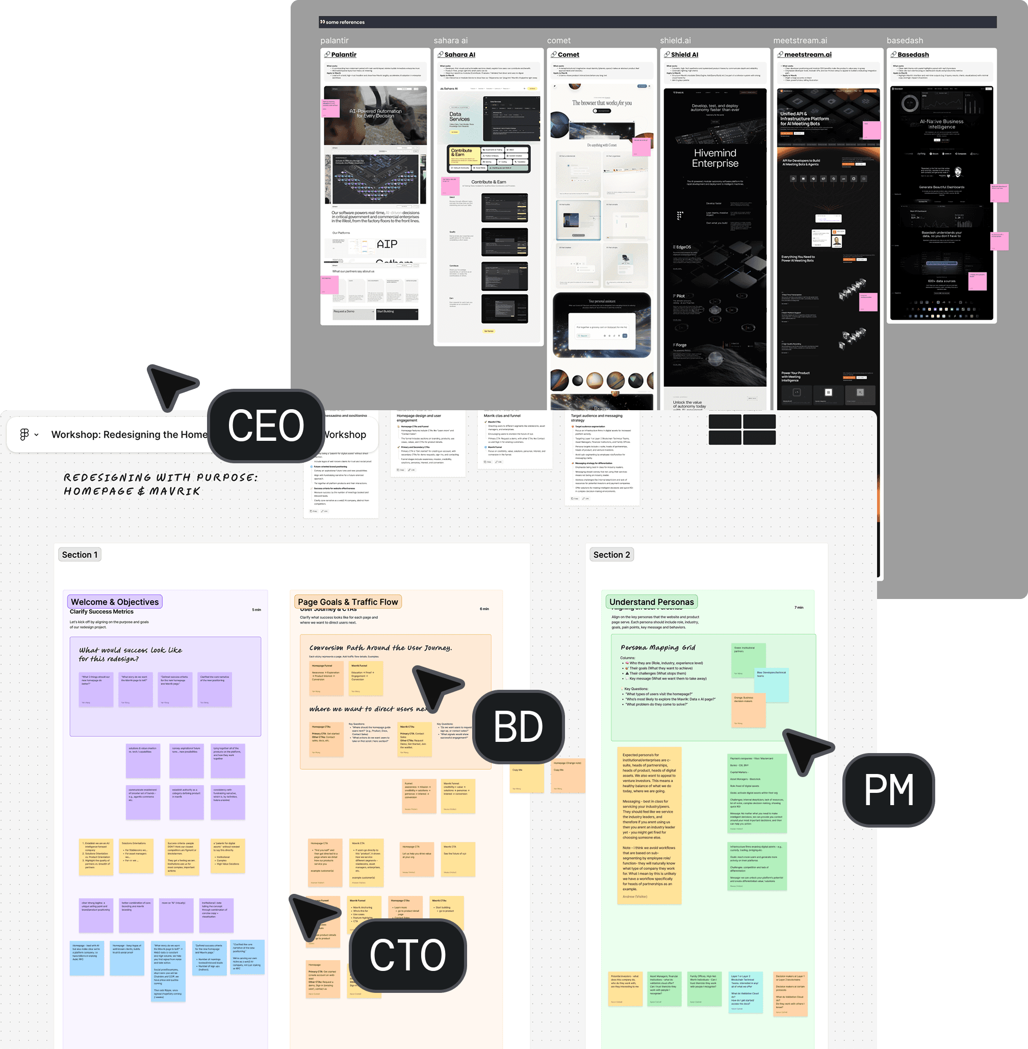
Before touching Figma, I ran a stakeholder workshop — C-level, BD, PM, design — to align on narrative, audience, and credibility. Async Slack threads had been the default and decisions were stalling. The workshop resolved in hours what weeks of back-and-forth hadn't.
01
Stakeholder workshop
Brought together C-levels, BD, and PM to align on story, audience, and what builds trust early in the scroll. Shared decisions move faster than async review.
02
Visual direction exploration
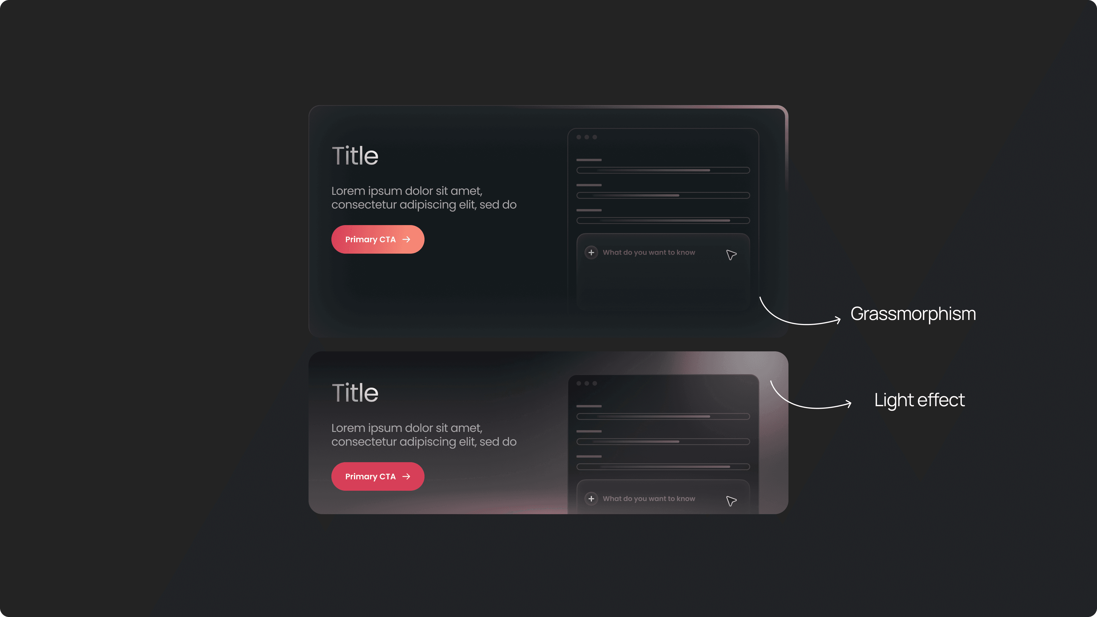
Diverged through 3D graphics, abstract motion, scenario-based video. Converged on a scenario-based hero video — showing Mavrik in action — paired with glassmorphism and light effects to signal "AI-driven" without breaking from the existing brand.
03
Design system & visual language
Simplified the palette to black, white, and red. Replaced colorful illustrations with gradient visuals. Added glassmorphism and light effects for a modern, AI-forward direction — while keeping red as the brand anchor for existing clients.
04
Full website rebuild in Webflow
Rebuilt the entire marketing site, not just individual pages. Restructured navigation to reduce bounce and improve conversion flow. Every component modular and fast to ship.
05
System rollout across touchpoints
Extended the language to social posts, product logos, sales templates, and all marketing materials. Every team now has a consistent visual vocabulary.
06
System rollout across touchpoints
Extended the language to social posts, product logos, sales templates, and all marketing materials. Every team now has a consistent visual vocabulary.
What I built
This project was never just a redesign. It was about building infrastructure that lets design scale — across teams, products, and future workflows.
01
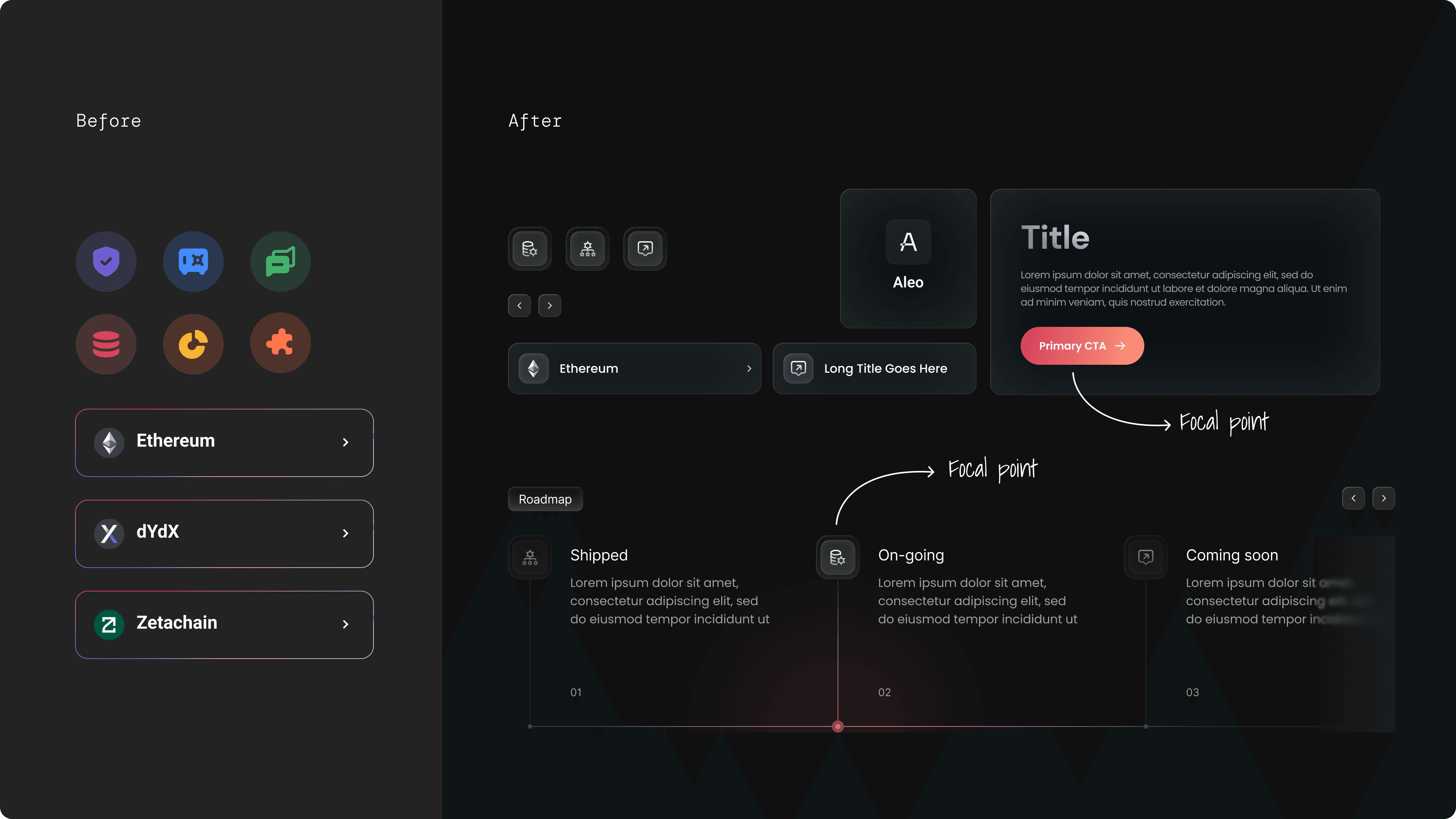
Unified Design Language
Defined a complete visual system: color (black / white / red), typography scale, motion principles, and component library. Shifted the brand from generic Web3 aesthetics toward a modern, AI-forward identity that still felt continuous for existing clients.
Color palette reduced to 3 anchors for maximum clarity and recognition
Gradient visuals replaced old colorful illustrations for a more technical feel
Glassmorphism and light effects signal AI-driven without abandoning the brand
Applied consistently: web, product UI, social, sales, internal decks
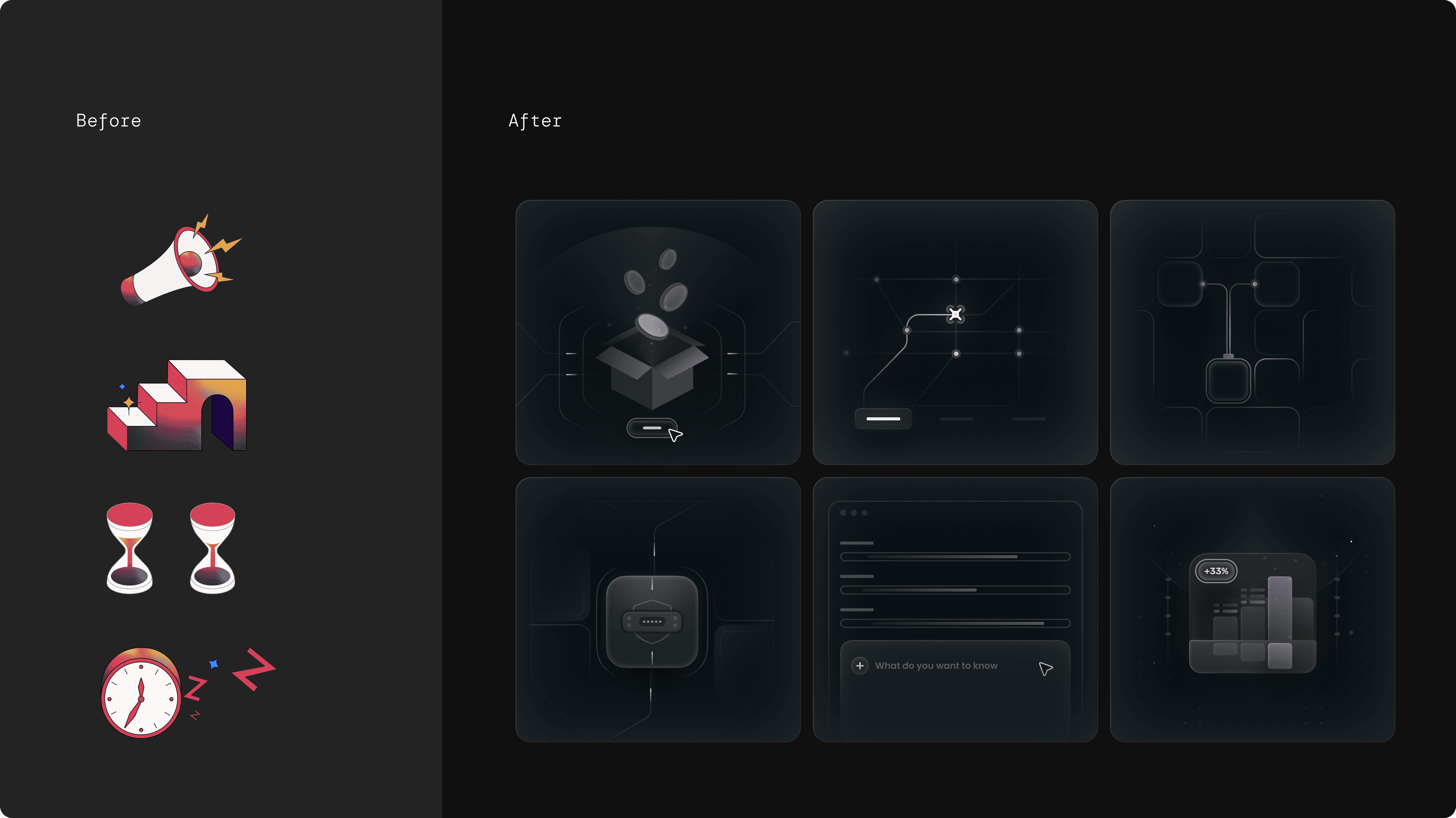
One visual system across every product and marketing surface
02
End-to-End Website Rebuild
Rebuilt the entire Validation Cloud marketing site in Webflow — every page, every component, under the new design language. The Mavrik product page was the centerpiece: restructured from a weak single-flow page into a narrative that earns trust and drives conversion.
New narrative arc: hero video → partnerships → audience fit → product values → product layer → CTA
Partnership logos added above the fold to reduce the high hero bounce rate
Target audience segmentation (payments, capital markets, banking, Web3 enterprise)
All implemented in Webflow with modular components for speed and reuse
Full site rebuilt under one system, not just individual pages refreshed
View it Live
03
Brand Hub — AI-Powered Asset System
The Brand Hub is an internal, agent-based tool where any team member can access logos, icons, banners, templates, and social assets — in the right format, on demand. This is not a static brand guidelines doc. It is a live system with a conversational AI agent built in.
Centralized access to all brand assets: logos, icons, banners, product marks, templates
AI Brand Agent: ask for any asset by format, size, background, or product and the agent surfaces it
Enables non-design teams to self-serve without Slack requests or designer bottlenecks
Reduces inconsistency caused by teams using outdated or off-brand files
Designed to support future AI-driven content generation workflows
Design enabling scale, not just execution
Reflection
This project evolved from a website redesign into building scalable brand infrastructure — enabling Validation Cloud to move faster, stay visually consistent across every touchpoint, and support the AI-driven workflows the company is building toward.
Working within an existing brand meant every decision was a negotiation between freshness and familiarity — finding that line and defending it was the real design challenge.
Moving from async Slack to structured workshops was itself a design decision. Facilitation and alignment are part of the work — they are not overhead.
Designing and implementing in Webflow simultaneously forced modular thinking and ruthless prioritization. That constraint made the system more durable, not less creative.
