Founding Product Designer on a 3-person team. Designed the product UX, brand identity, and marketing website for CardTie — a visual form builder where branching logic is drawn as lines, not hidden in dropdowns.
Role
Timline
8 months, 0 → 1
Scope
Product · Brand · Website
Status
Shipped · Live on Product Hunt
View it Live
8
months from zero to shipped
1K+
website visits in 5 days post-launch
3
rounds of user research driving pivots
2
brand directions explored before landing


Keep reading the full case study
01 — The Problem
Every form builder gives you the same thing: a list of questions, a stack of dropdowns, and branching conditions buried three menus deep. Build something complex enough — a multi-step survey, a conditional order form, an interactive quiz — and you'll find yourself hunting through nested settings just to understand what you built.
We asked a different question: what if the logic was just... there? What if you could see the whole form at once — every question, every branch, every path — laid out on a canvas like a map?
That's the problem CardTie was built to solve. Not a better form builder. A visual one.
Form logic has always been hidden behind dropdowns. We wanted to put it in front of your eyes.
CardTie is a visual form builder where every question is a card, and every logical connection is a line you draw. The canvas replaces the spreadsheet.
02 — Role & Context
CardTie started as a side project in August 2024 — a small team of three: a PM (Dastion), a developer (Lin Yi), and me. No design system. No established product direction. Just a belief that form logic deserved to be visual.
As the only designer across 8 months, I owned everything from product UX to brand identity to the marketing website. That meant navigating real constraints: shifting product scope, dev timelines that didn't always match design ambitions, and a founding team learning to build together for the first time.
Product UX –
Whiteboard editor, card system, slide view, branching logic, analytics dashboard
End-to-end design of the core product from blank canvas to shipped interface.
Brand Identity –
Two direction explorations, final palette, mascot character, logo system
Built the visual identity that carries across product, website, and social presence.
Website & Launch –
Full marketing site in Framer, Product Hunt gallery assets, launch copy
Designed and built the website that received 1,000+ visits in the 5 days after launch.
03 — The Pivot
The original vision for CardTie was broader: an all-in-one knowledge whiteboard, closer to Heptabase — a place to map any kind of content freely. But when we watched real users interact with the tool, a pattern emerged.
A blank canvas paralyzed people. Without a defined purpose, they didn't know what to do with it. The "start from anything" promise created friction instead of freedom.
But two things consistently made eyes light up: the moment someone connected two cards with a line, and the PPT view — the ability to flip the canvas into a slide-by-slide presentation that respondents could navigate step by step.
Those two reactions told us where to focus. We narrowed from "knowledge whiteboard" to "visual form builder with branching logic." The canvas didn't disappear — it became the differentiator.
Two things consistently made users' eyes light up: the moment a line connected two cards, and the PPT view. Those two reactions told us where to focus.
The feature that changed the product direction:
visual branching logic, drawn as lines between cards.
04 — Brand Identity
Early in the process I developed two distinct brand directions to pressure-test where CardTie wanted to live visually.


Direction A –
Warm & Hand-drawn
Sketchy illustrations, organic line work, a green cat mascot, cream backgrounds. This direction felt approachable and human — like a notebook that had come to life. The energy was playful and tactile.
The risk: it read more like a journaling tool than a SaaS product. For users building complex forms or order flows, the warmth might undercut credibility.
Direction B –
Modern & Technical
Abstract card blocks, gradient mesh, high-contrast green and yellow accents, clean geometric type. This direction felt confident and product-forward. It signaled "this is a tool that works."
The risk: it leaned corporate. There was nothing memorable to hold onto — no personality, no warmth that would make someone feel like they'd found something made just for them.
Neither direction was quite right on its own. The final identity took the hand-drawn warmth from A and the palette confidence from B — and added a dog.
What we landed on
The final brand merged both directions. We kept the green-yellow palette and clear typographic hierarchy from Direction B, but brought in hand-drawn illustration elements, doodle accents, and — crucially — replaced the cat with a French Bulldog mascot that became the product's personality anchor.
The dog appears throughout the product: in the empty state when you open a new board, in the analytics Seat Overview as submission indicators, on the website hero. It's the detail users notice and remember.
The result is a brand that feels designed by humans, for humans — which matters for a product trying to make a technically complex thing feel approachable.
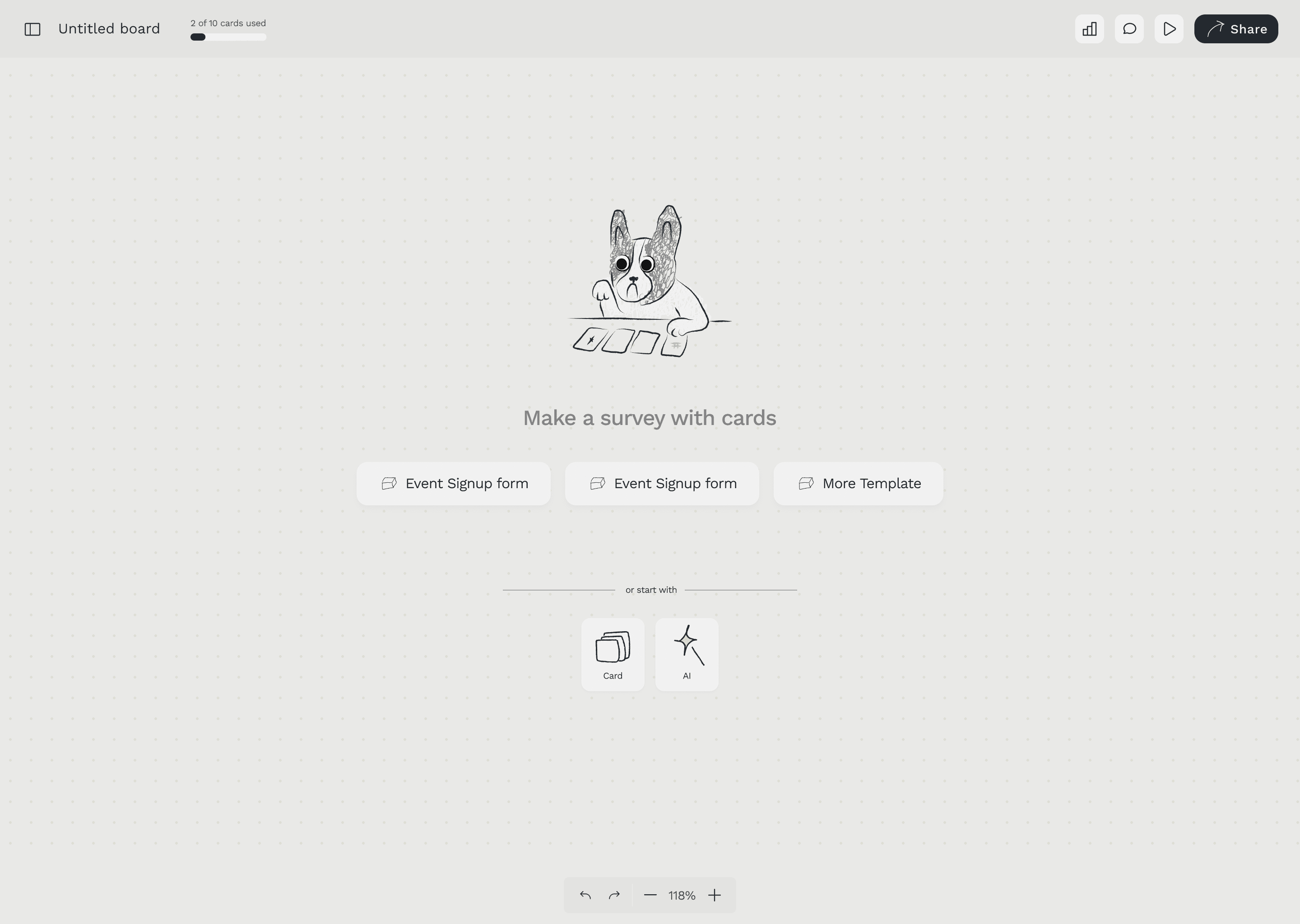
The dog mascot in the empty state onboarding screen — the brand's personality in product.
05 — Key Design Decisions
Four decisions that defined the product.
Decision 01
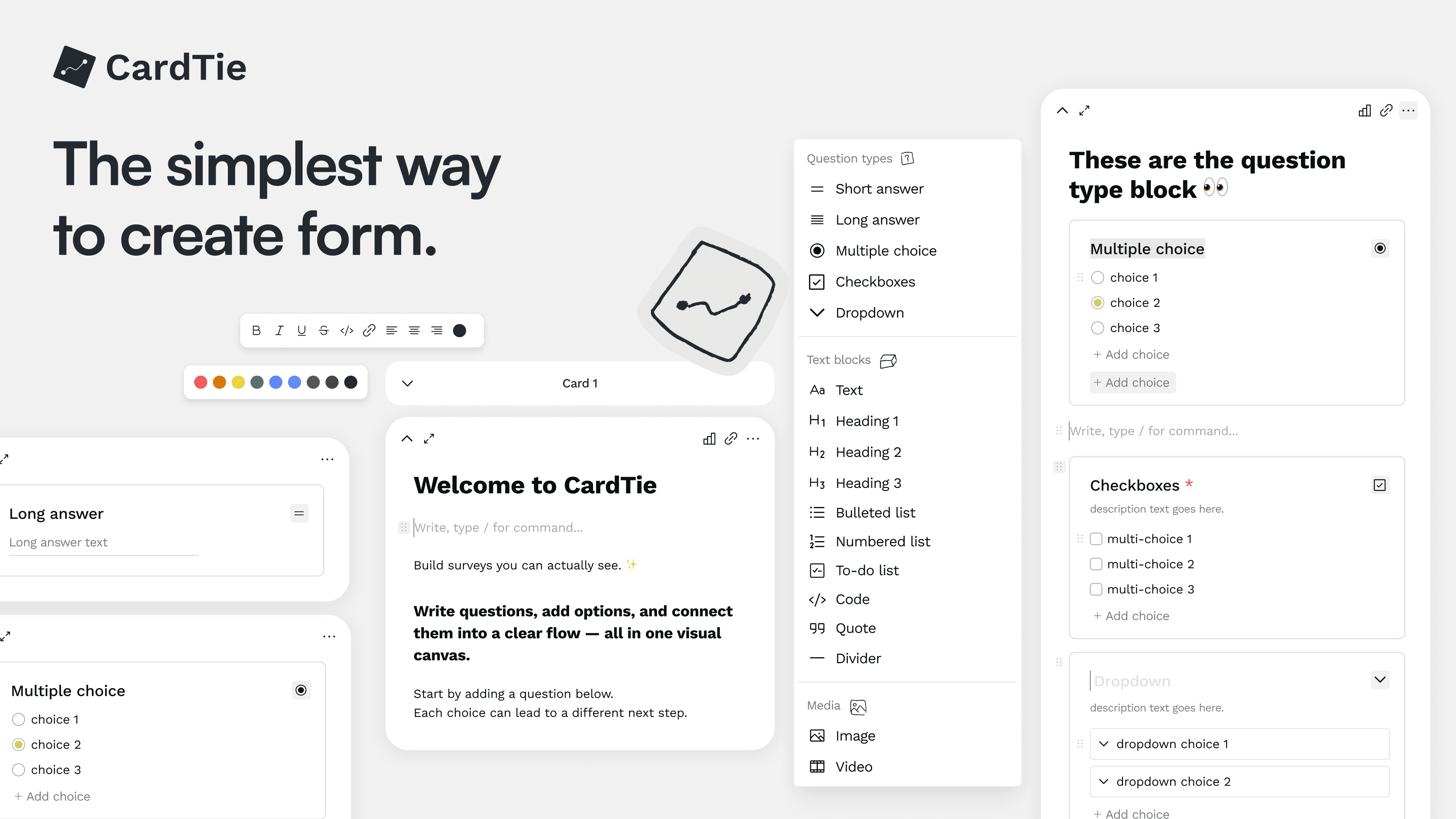
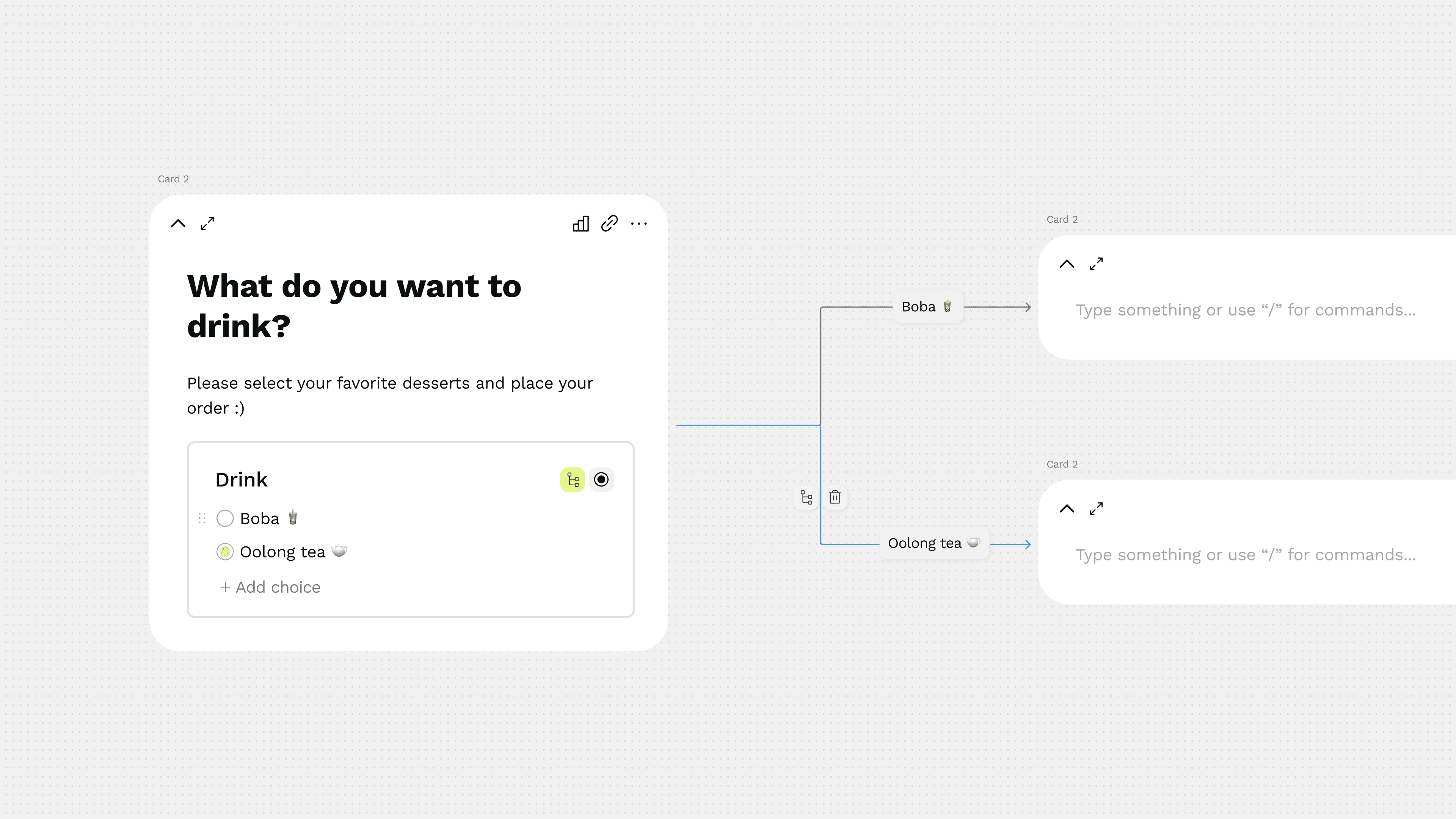
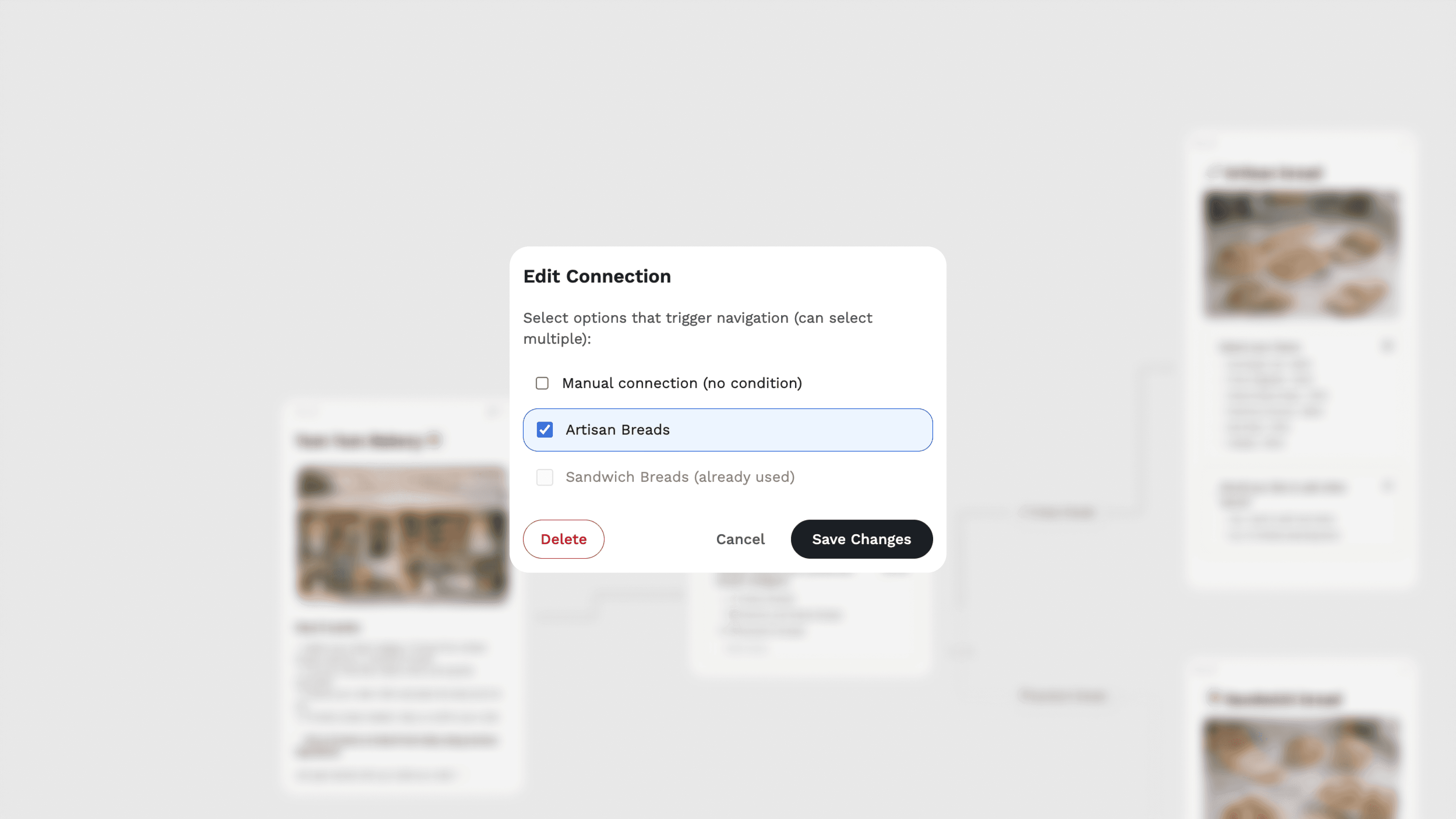
Lines, not dropdowns
In every other form builder, branching logic lives in a settings panel. You select "if answer is X, go to question Y" from a dropdown. It works — but you can never see the whole shape of your form. You're always looking at one condition at a time.
In CardTie, you draw a line. Select a choice, click "Add branching," and a line appears connecting that choice to the next card in the flow. The form becomes a diagram you can see, zoom into, and rearrange on the canvas.
This was the core interaction design challenge of the whole product: how to make something as abstract as conditional logic feel physical and visual. The line was the answer.
lines drawn, connecting choices to downstream cards.
Decision 02
Slide view alongside whiteboard view
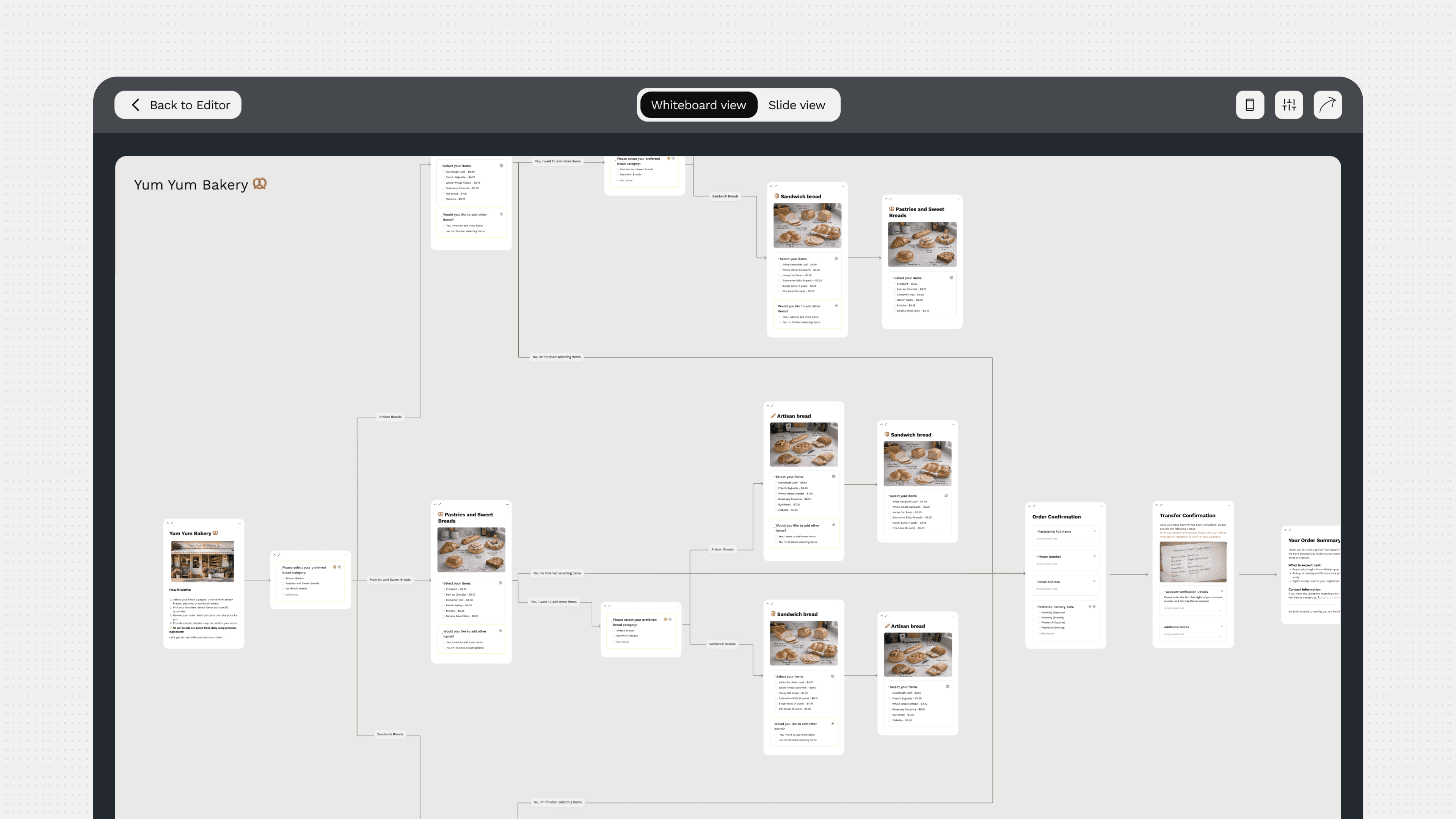
The whiteboard canvas is for builders — the people designing the form. But respondents don't need to see the whole map. They need to focus on one question at a time, navigate forward and back, and feel like they're moving through something coherent.
Slide view renders the same cards as a full-screen, step-by-step interface — one card per screen, with a progress indicator and navigation arrows. The builder sees the map; the respondent sees the flow.
This was consistently the feature that made new users stop and say "oh." In user testing, it was the moment the product clicked — when people understood that the canvas and the form were the same thing, just seen from two angles.
The same form, two views. Whiteboard view for builders. Slide view for respondents.
Decision 03
The card system — one block per question
Cards are the atomic unit of CardTie. Every question, every content block, every media element lives inside a card. Each card can contain multiple block types — a question title, a description, a multiple choice block, an image — and cards connect to each other through lines.
Early on, this was a technical constraint: one block type per card. But through iteration, we expanded the system to support mixed block types inside a single card, which is what enabled the rich form structures users actually needed — like a card combining an image with a choice question, or a header card leading into a multi-question section.
Designing the card system meant establishing a clear visual hierarchy: what belonged in the card, what lived outside it, how blocks nested, how the question type icons communicated content type at a glance.
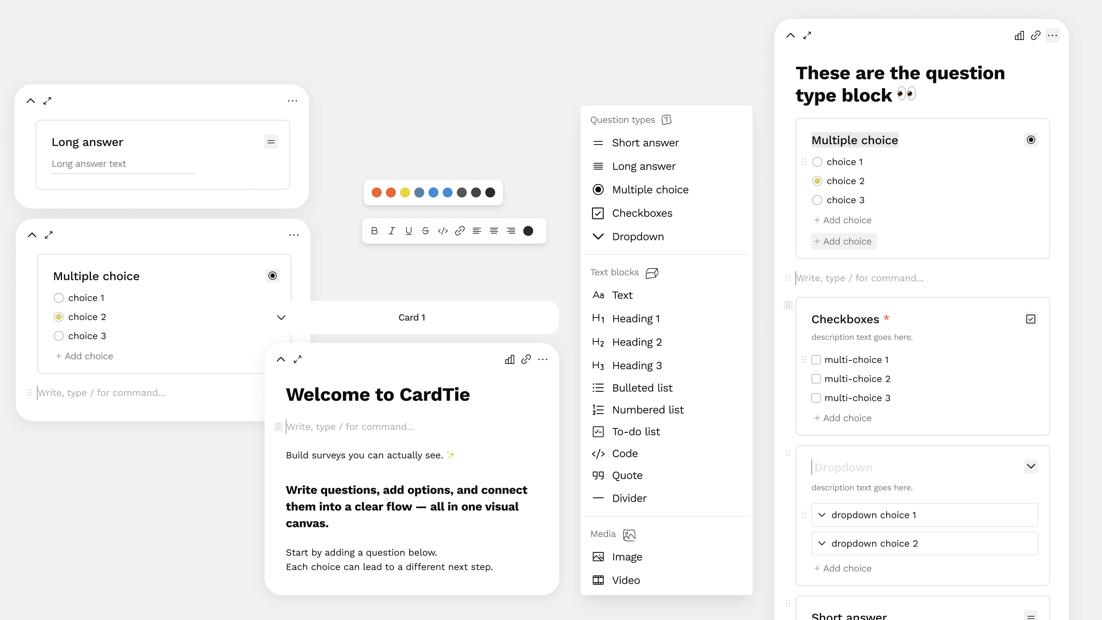
The card system: multiple block types (multiple choice, checkboxes, dropdown) nested inside a single card.
Decision 04
Analytics that match the canvas
Most form analytics show a table of responses or a set of isolated bar charts — each question answered in a vacuum. The responses exist, but the context is lost.
CardTie's analytics brings the data back to the canvas.
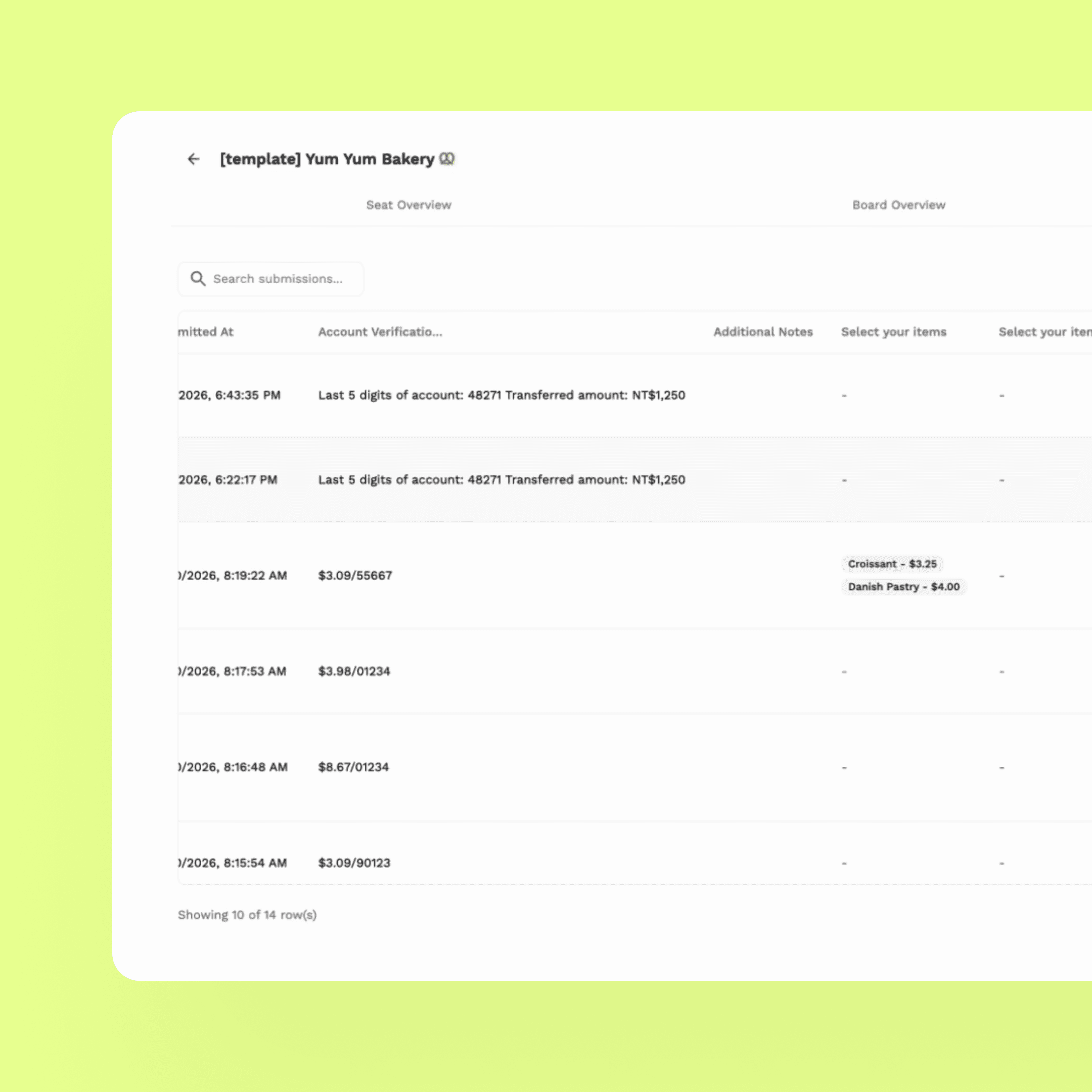
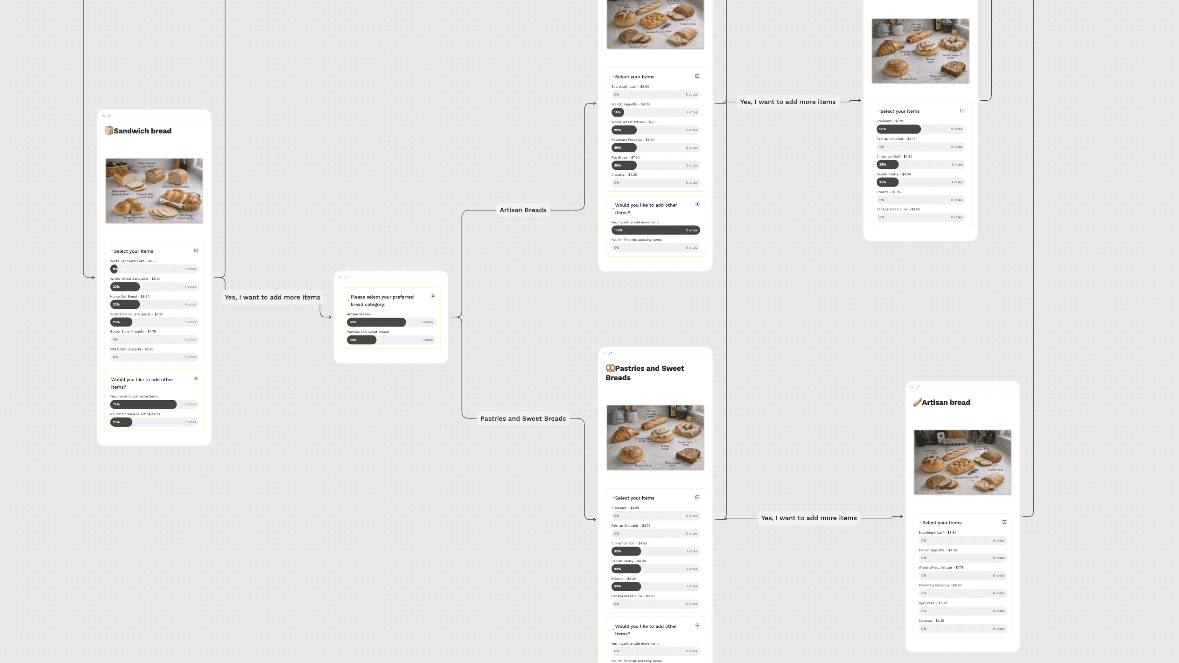
In Board Overview, you see the actual whiteboard with response stats overlaid on each card — percentage breakdowns and vote counts visible inline, alongside the connection lines. You can see not just what people answered, but how their path through the form branched.
Board View
The Seat Overview takes a different angle: a grid of dog mascot icons (one per submission), filterable by field value. Click any submission to see the full response detail. The result is an analytics dashboard with personality — one that feels like it belongs to the same product as the editor.
Seat View
06 — AI Integration
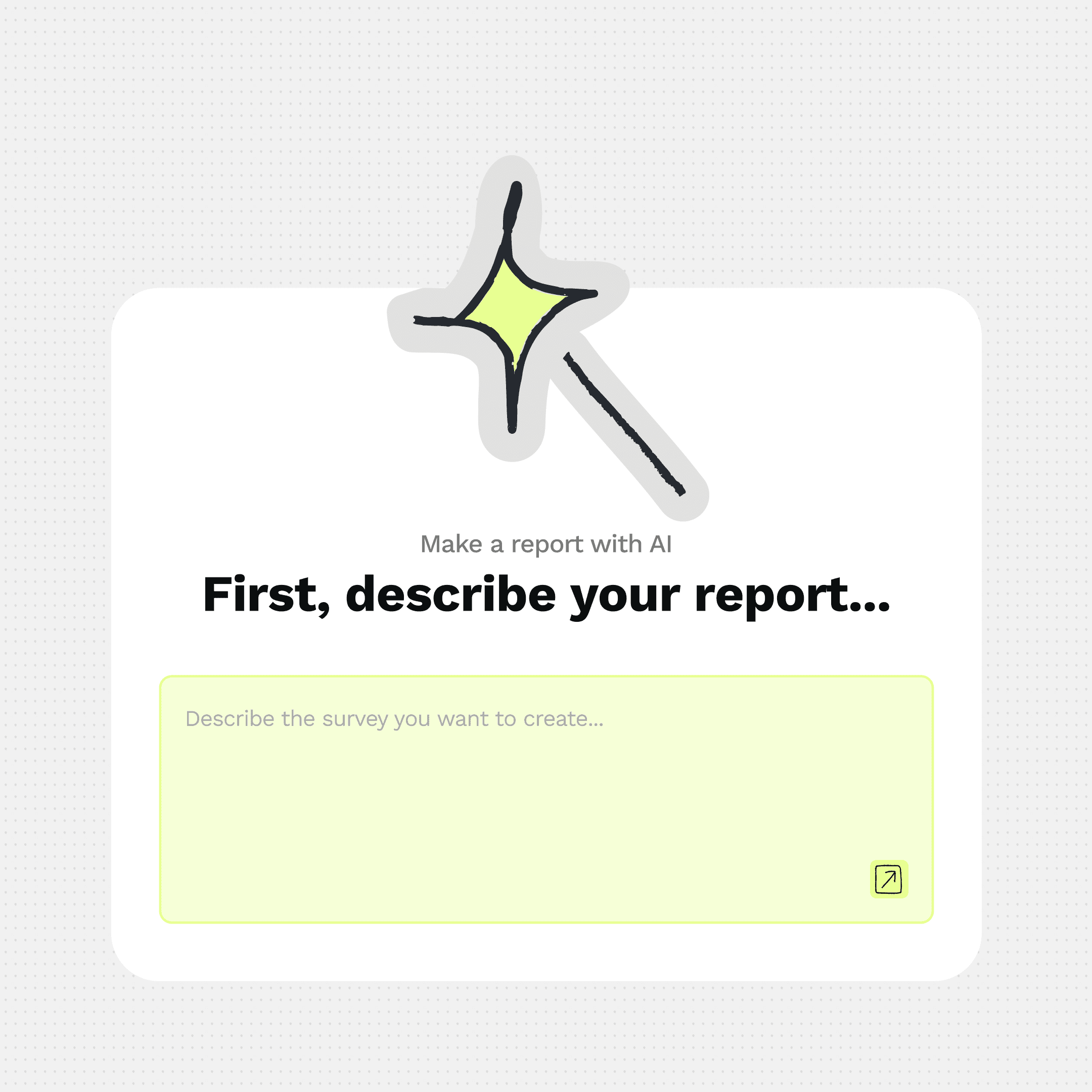
CardTie includes an AI card generation feature: describe your form in plain language, and the AI generates a structured outline — cards, questions, and block types — that you can review before accepting.
The key design decision here was the confirmation step. The AI shows you an outline first. You see what it's proposing before a single card appears on your canvas. Accept, discard, or try again. This keeps the user in control of their form structure rather than handing it over to the model.
The AI prompt input lives inline with the canvas — a small floating text field that doesn't interrupt the whiteboard context. Type, confirm, watch the cards appear. The experience is closer to asking a collaborator than running a generation pipeline.
empty card → AI generates outline → user confirms before accepting.
07 — Website Design
The hardest part of marketing CardTie is the same as using it — you have to see it to understand it. A text description of "visual form logic" doesn't land. You have to see cards on a canvas, connected by lines, to get it.
The website was built entirely in Framer. The hero section became the product's elevator pitch in visual form: scattered cards floating in the background, the dog mascot holding a card, and the headline "Form on Canvas. Logic in Lines." — six words that capture the entire product idea.
View it Live
The headline that took the longest to write
"Form on Canvas. Logic in Lines." replaced the earlier tagline "Map your content. Tie them with cards." — which described the mechanic but not the insight.
The new version tells you what's different about CardTie in two sentences: the canvas is where you work, and the logic is something you can see. It's specific enough to intrigue, simple enough to stick.
Building in Framer with a live product behind it
One challenge throughout website production: the product was still changing. New features would ship mid-build, requiring website updates that sometimes had no corresponding design assets yet.
This taught me to design the website as a system, not a series of screenshots — using motion and illustration to communicate the product concept rather than relying entirely on screen recordings that might become outdated.
08 — Reflection
Eight months of building. Here's what I'd tell myself at month one.
Build the design system before the second feature ships
I started building components without a system — tokens, spacing rules, component states all lived in my head or scattered across Figma frames. By the time we were shipping analytics and AI features, the dev team was making visual decisions without a source of truth, and new components were inconsistent in ways that were expensive to fix later. A lightweight system from month two would have saved weeks.
Validate the UX before polishing the UI
There were moments where I spent real time refining visual details on screens whose underlying UX wasn't yet confirmed. The tension between "good enough to test" and "good enough to be proud of" is real in a side project with limited time — but in hindsight, I should have been more comfortable shipping rougher visuals earlier, and reserving polish for what had already proven its value.
Website and product need to evolve together
In the months before launch, the team split naturally: the developer focused on feature shipping, while I focused on the marketing site. We lost integration. New features shipped without website representation; the website started making promises the product was still catching up to. A tighter feedback loop — even a shared weekly check-in on what was live vs. what was shown — would have helped.
Launch earlier, with a better link
When we launched on Product Hunt, the shared link pointed to the app login page — not the marketing website. Most visitors landed on a sign-in screen with no context and no reason to continue. It was a configuration error that cost real conversions. The lesson isn't just "check your links" — it's that launch readiness is a design problem too. The whole journey from "I just saw this on Product Hunt" to "I understand what this does" needs to be designed end to end.
09 — Outcomes
A product shipped. A few things learned the hard way.
8
months from zero to shipped
1K+
website visits in 5 days post-launch
3
rounds of user research driving pivots
2
brand directions explored before landing
What worked
The core interaction — drawing lines to define logic — consistently resonated with users who saw it. The brand identity, especially the dog mascot, gave CardTie a personality that stood out in a category full of generic SaaS tools. The website hero communicated the product concept without requiring the user to read documentation.
What I'd change
The launch link pointed to the app, not the marketing site — a critical error that disrupted the new user journey. We missed the optimal Product Hunt launch window. And the design system remained incomplete throughout, which added friction to every new feature built in the final months. These are launch and process failures, not product failures — and they're the most teachable kind.
